Showing posts with label design by kaelah. Show all posts

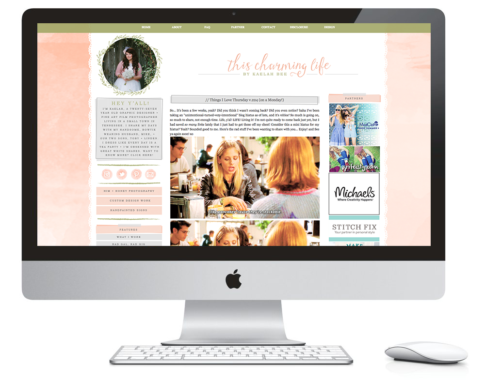
// A Charming New Look!


Just trying to keep things kinda, sorta, a little bit fresh around here. Something a bit more subtle for spring. C'moooonnnnn green stuff! Grow! I'm working on wrapping up two client projects this week so naturally I needed to take a little breather to tinker with a personal project or three. Nothing major or fancy, but fresh for sure. If you're looking to have any design work done (blogs, print, logo, etc), drop me an email and let's chat!

xo KB

// Welcome To This Charming Life!


Hey friends! Long time, no talk! I kept saying I was going to launch the new design + name, but then I just never did it. Honestly as time went on it just felt forced. Like I was waiting for someone's permission or approval. It never felt quite "right." The few weeks that I took off were so nice. I just did my thing and didn't worry about the blog. Mike and I went to Mexico for 8 days and we enjoyed some much needed one on one time (more on that later!), and we came home with fresh, relaxed minds and eager hands. We've been eyeball deep in house projects and renovations while he waits to take his NCLEX for his nursing license. All of a sudden, out of nowhere, it felt like the "right" time yesterday... to overhaul everything and get back to it.

I have no set plans aside from a few new features I want to introduce. I have no posting schedule and nothing to really adhere to. I'm kind of glad. I just want to write what I know and do and feel and think. Loads of pages and things will change in the coming days/weeks. But I felt like I needed to jump on it while the mood was there.

Hopefully you'll stick around for it!

Leave your links below if you want me to check out your blog/instagram/shop/whatever! I feel like I don't know y'all anymore! haha

xo KB

PS; Wondering where the name is from? From a Joan Armatrading song! Enjoy!

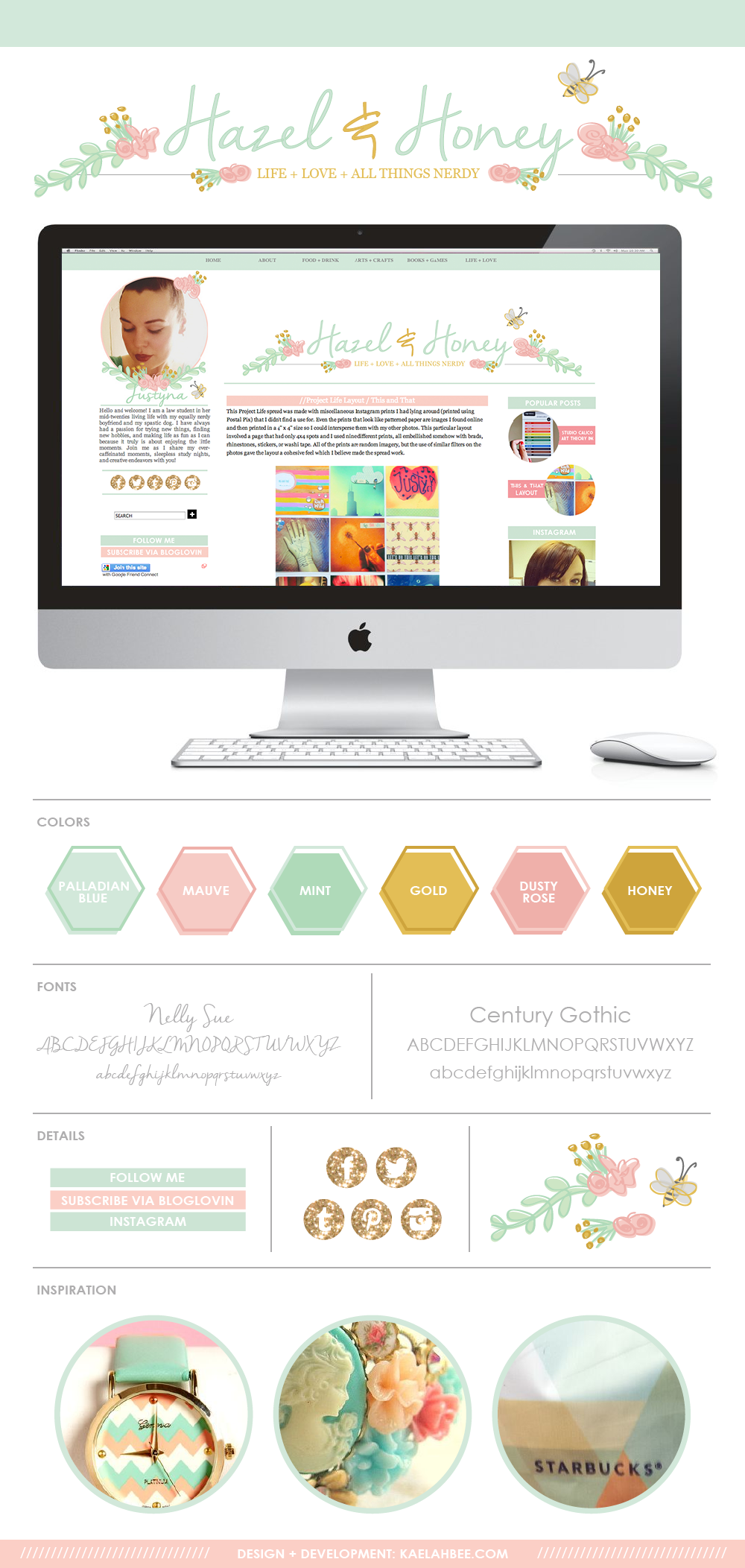
// Design: Hazel and Honey


Here's a recent design I finished and installed for the lovely Justyna of Hazel and Honey. This is by far one of my all time favorite designs I've ever done and if you've followed me for a while then you'll see the very obvious inspiration: our photography branding. Even the name is similar! (though I didn't have any hand in that haha) The colors and illustrated elements really have the same vibe and I was almost crossing my fingers she'd hate it so I could use it on my own blog! (Truth be told, a lot of my own blog's design tends to stem from rejected client mocks... I fall in love and then tweak them to my own liking. I may or may not be in the midst of a new layout design for TCGG already...) I feel really lucky that I get to design with a very distinct style that I enjoy, and I love when my clients share a similar aesthetic.

I was able to start and finish Justyna's design pretty quickly considering I was trying to tie up all client projects. I feel like this gig really breathed some new life into my desire to create unique spaces for bloggers, so I'm really looking forward to getting back to the grind after my maternity leave. 

I'm currently booking clients for my return (exact date yet undetermined) but if you'd like to get on the list, please feel free to send me an email! (It may take me a few days to get back with you, but I promise to respond ASAP!) I'm more than happy to discuss payment plans and project timelines with you so everyone wins! Thanks for taking a peek at Justyna's new space.

// Recent Blog Designs - Now Accepting Spring/Summer Clients!

It's been a while since I shared a roundup of some recent blog design work, so what better time than now to get it all out there, right? Some of these are a few months old as I've been working on some larger scale projects that have taken a couple of months to complete, and I have several in the pipeline currently. Hopefully I can get 100% caught up on sharing these before I take a little "maternity leave" this Summer. I'm planning on booking a handful more clients to fill the next 4-6 weeks, then it'll be "go time!" So crazy! Anyway, here's what I've been up to recently...

This was hands down one of my favorite projects when it was all said and done. Allison wanted something classy and modern, but still with a lot of personality. I did a custom geometric background and then played up the black and white with gold glitter and peonies. I feel like it totally fits her style and I love all of the graphic elements.
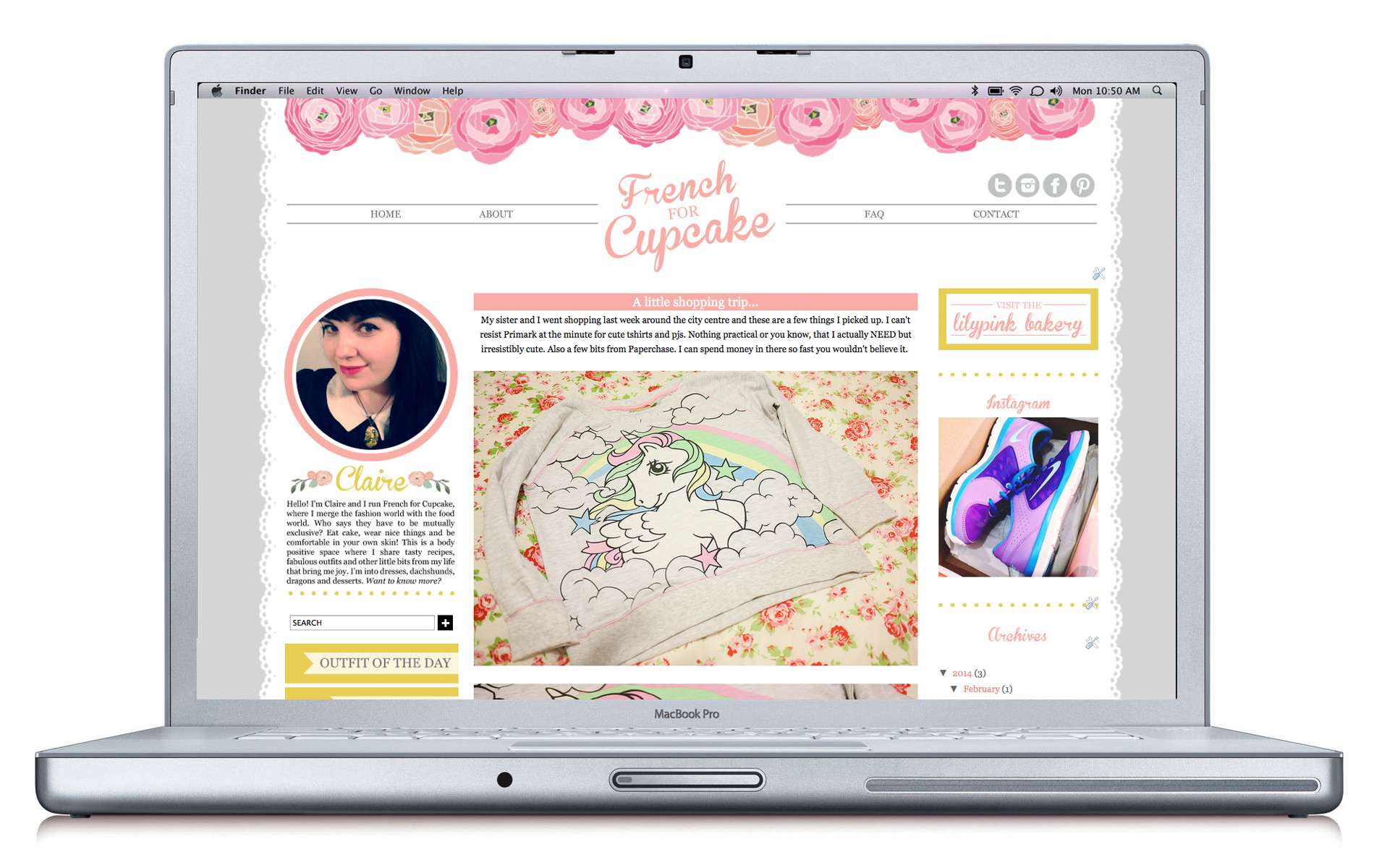
Claire is like my long-lost soul sister. I am totally on board with her style and aesthetic, and that's why I enjoyed this project so much! Ranunculus flowers and a soft grey accented with saffron yellow?! That's what I'm talking about! I illustrated a handful of flowers to pop around her name and then just let the rest of her content do the talking. I'm in love with how the header turned out.
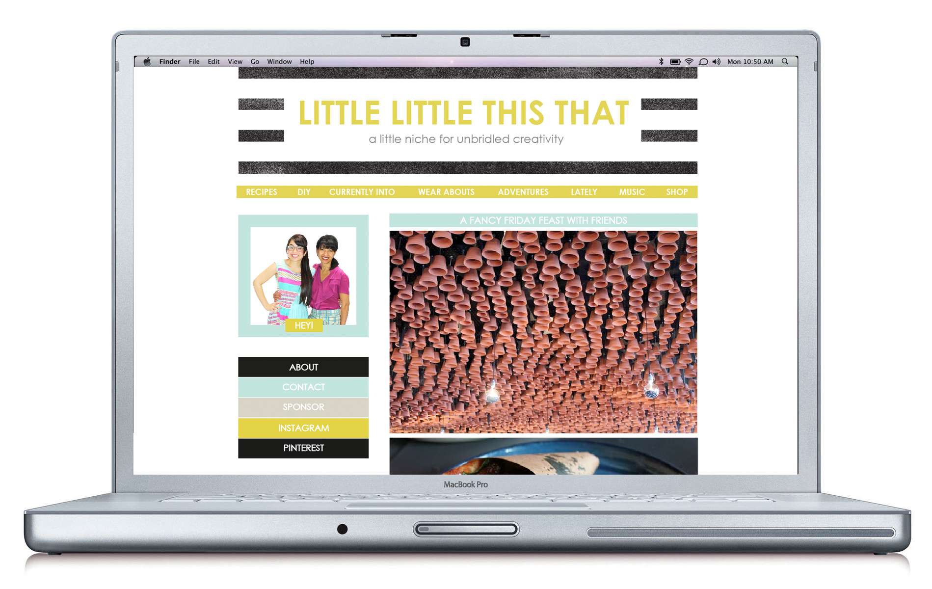
Little Little This That
This mom and daughter blog was started from the ground up, hence why you're actually seeing a mock instead of the live preview. Tess and Clara came to me with a solid vision for what they wanted and I loved seeing it all fall together. They have an amazing eye for color and texture so while I may not have chosen these colors myself to start, I am stoked with how they all work together! This design is proof that you don't have to be crazy and decorative with graphics in order to make a loud statement.
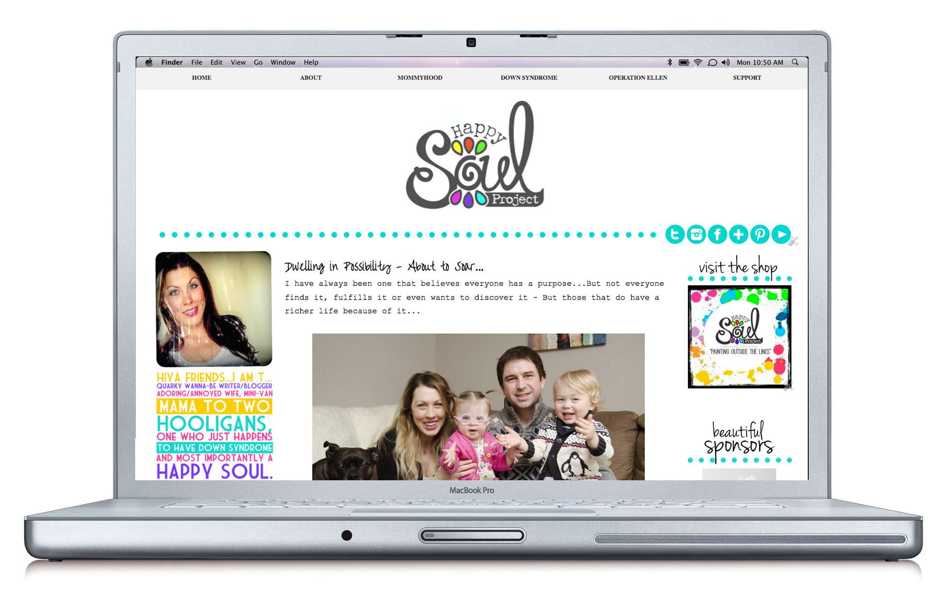
Tara came to me wanting a bright, cheerful space to help share her daughter's story of living with Down Syndrome. She had a logo ready to go, but it was up to me to find a way to tie in the fun colorful elements while keeping it very minimal and streamlined. The preview above doesn't even do it justice because there is just so much color happening below the fold! You'll have to pop over and check out the sidebars yourself!

First off, Cree is an absolute sweetheart! I've made several signs for her family over the past year and I was over the moon when she contacted me about a blog design. I loved all of her ideas and it just took some trial and error to see what would end up working perfectly in the end. She chronicles her life as a military wife and mom (currently) in Germany, and the softness of the color palette totally fits with her kind demeanor.
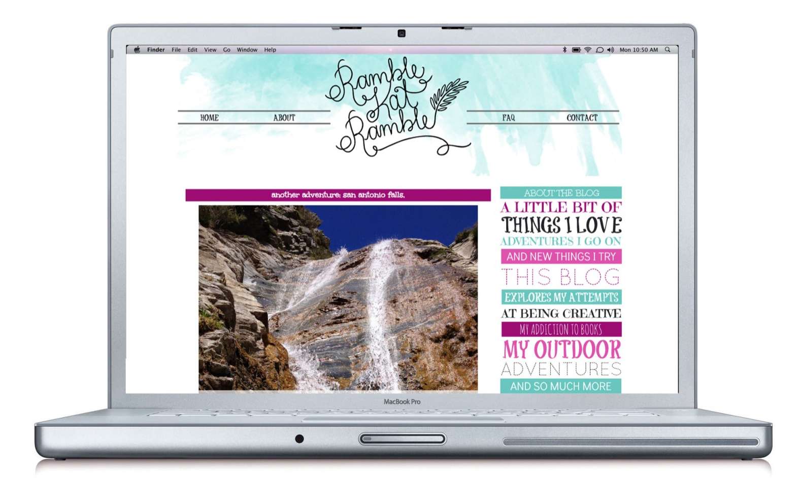
Kat wanted something bold and loud with a lot of really bright colors and typography! The blog itself is super streamlined and minimal, but the little bits of personality really make it shine. I hand-drew her header and then added in some fun watercolor to balance it out. The purple really helps liven the place up!
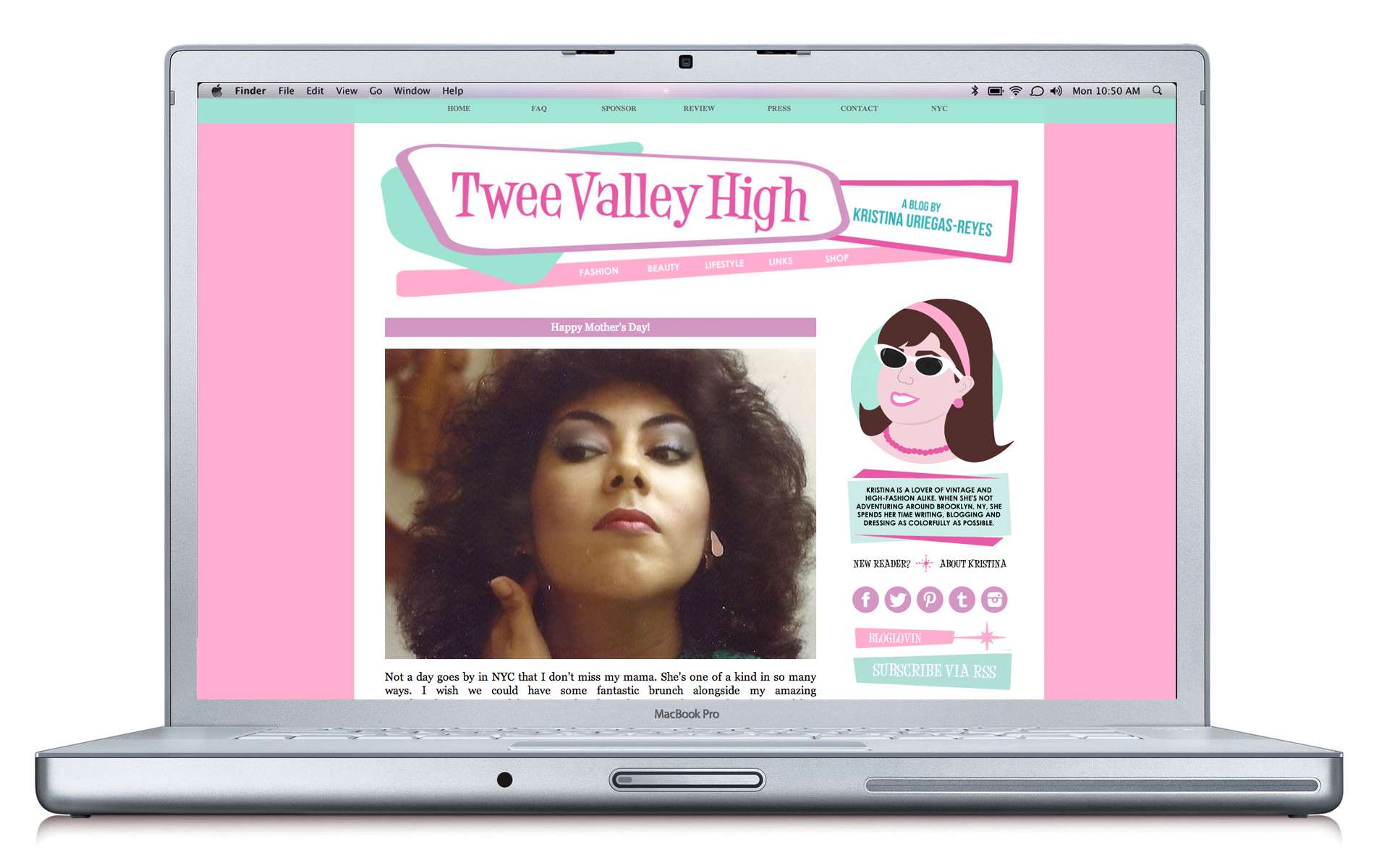
Kristina really wanted something bright and fun to match her mid-century lovin' aesthetic. She knew she wanted some pink and mint, and she really wanted a fun illustrated portrait, too. I whipped up this adorable little diddy of her and then really played up the 50's + 60's style in the design. We had a lot of back and forth in the emails, trying new things, tweaking stuff for a bit, and nixing things here and there. After installing we both realized it would be a much stronger design if it had only one sidebar instead of two, so we condensed them over on the left and really let her pictures shine. We also skipped out on the scallops that we started with (in the background) because we thought the clean lines helped it flow better. Kristina has an adorable little life in NYC and I think this fits her perfectly!
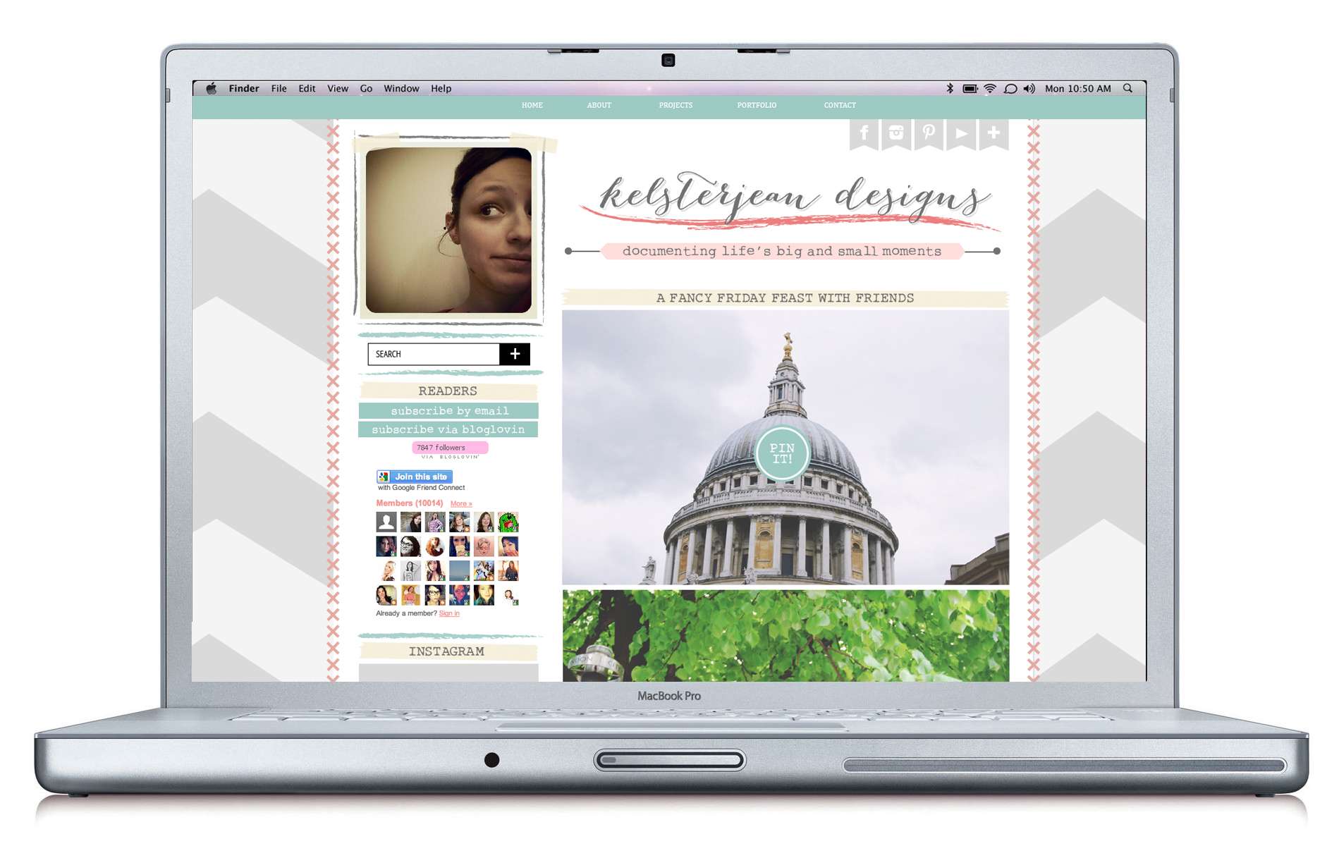
This was my most recent installation as it went live just on Friday! Kelly Jean and I have been working on this design for the past several weeks and she really wanted something that would accent her scrapbooking designs without overwhelming them. She chose a really great color palette and we added little "3D" details like stitching on the border and masking tape on the sidebars and post titles. We also played up the typewriter style font to make it really feel DIY'd. I love the subtlety of the colors mixed with the fun patterns!

++++++++++++++++++++++++++++++++++++++++

Overall I'm really happy with how things are progressing with my freelance blog designs. Both my style and execution have come a long way since the very beginning. I've just gotta remember to share this stuff more often! I get so wrapped up in my actual projects and clients that I forget to publicly show them. (To see past designs shared, click HERE!)

If you're in the market for a full design overhaul for your Blogger blog, or some a la carte pieces (header, business cards, etc) for your business/blog (on any platform), don't hesitate to get in touch! I'm currently running a pretty sweet special to book up the final few spaces before I sign off for a few weeks. I can work with almost any schedule - whether you prefer to have your design up and running in 1 week, or a 4-6 week payment plan to help with your budget! (Each design shown above features the all-inclusive package that I offer which also comes standard with a matching business card design, social media headers, and even my PR + Marketing Ebook for bloggers!)

If you'd like to chat about a possible blog makeover, email me and we'll talk! Now to work on a few other design projects I have lingering about... that way I can share those soon, too! Happy Tuesday! xo

// Him + Honey - Nashville Portrait Photography Rebrand


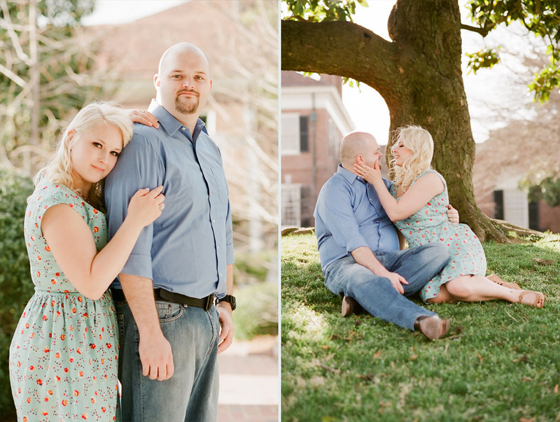
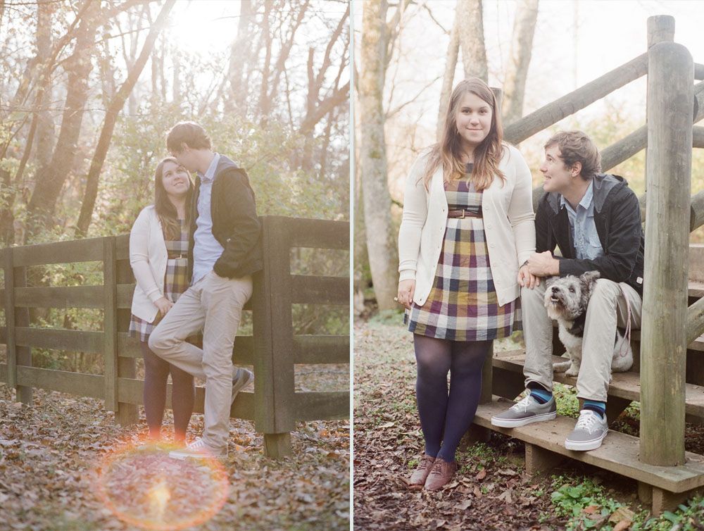
I'd be lying if I said I wasn't totally in love with being a film photographer. There's just something so magical about the look and feel of film. It's so rewarding (and scary!) to ship rolls across the country and then wait ever so patiently for them to be returned. You never know which ones turned out and which ones were flops. Sounds silly to love the unexpected, but it allows us to really focus on the person in front of our camera... not the image on the screen. 
Starting this business with Mike has been one of the best decisions I've ever made. He had his digital photography biz for a while but it just wasn't fulfilling him in the way he had hoped. When he first started getting into film I pitched the idea that we should do it together. It'd be fun to learn the ropes and create something truly wonderful as a team. He was totally sold and so it began! We were racking our brains for a business name for what felt like forever... everything was just meh. I remember driving down to my parents' house from Nashville one night and I said "It's probably really dumb, but what about 'Him + Honey' for our name? It's stupid right? Yeah, okay nevermind, that was silly." I shot down my own idea before I could ever really pitch it. Luckily Mike loved it and talked me out of doubt, and it felt like the most fitting name possible. I love when that happens.
For the past year we're been slowing building steam as a brand. We didn't want to jump in too deep and figuratively drown. We wanted to test the waters, practice what we knew, and learn the ropes that way. Slow and steady. Our initial branding was thrown together (honestly) with little input from anyone except me and my hands on evening. The website was the same way. It was really just a stand-in for where we wanted to go. We put off the rebrand of Him + Honey forever because I was terrified we couldn't  come up with something (especially something that fit both of our aesthetic! Oh boy!) It was kind of amazing when one day we set out to each create a moodboard for the brand we wanted, and then we hashed out our ideas. Our moodboards were pretty varied, and while there was some overlap, I was sure that we were in for a long night. But then something amazing happened... I opened up Illustrator and I just quickly hashed something out with the brush tool... and we both loved it. We loved it so much in fact that the little flowers you now see in our logo are the exact quick, 5 second scribbles that I put on that artboard that day.They were perfect. The colors were spot on, they were just messy enough to have personality, but they matched the look and feel we both wanted for our brand. Fun, lighthearted, and not too serious... Why can't all branding be that simple?
The next few weeks revolved around me writing "him + honey" over and over and over. We finally found a combination that we liked, and we moved on to our website. Mike is super into minimalistic, white websites... I like a little bit more color. At the end of the day we went his route because it really does add a touch of class to the whole thing. Sometimes I have a hard time seeing the "less is more" aspect, ya know? There are still some things I want to change on the website... add, remove, expand upon... but I'm feeling so incredibly passionate about our new branding identity that I just couldn't wait to share! Here it is! The new and improved, Him + Honey 2.0!

We have a bunch of blog posts queued up on the new site so check back often to see the shoots we've recently done. If you want to get in touch about any sort of shoot or event, please don't hesitate to drop us a line! We make it incredibly simple and all you have to do is pop over to the Contact page.
Every single session we book, no matter how big or small, is truly an amazing experience for us. We get to meet these people, share in their stories, capture moments they'll cherish forever, and hopefully stay in touch for years to come. Him + Honey is something we truly believe in, and a lot of that is thanks to you! The blog readers who inquire about shoots, who encourage us. We sincerely thank you! And if ever comes a time where you need a photographer, please feel free to get in touch! We'd love to take you out for coffee and talk about everything! And remember - you don't have to be in Nashville to book a shoot! We're happy to travel... engagement shoots, weddings, family events. We love road trips!

Please visit the new and improved Him + Honey website. Let us know what you think! Please take a moment to "Like" us on Facebook while we overhaul it to match the new look! We can't wait to share the other aspects of our branding with you. Stay tuned! xo

// Kaelah Bee x DENIK

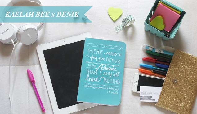
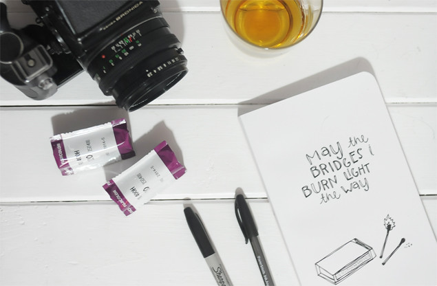
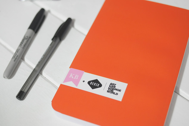
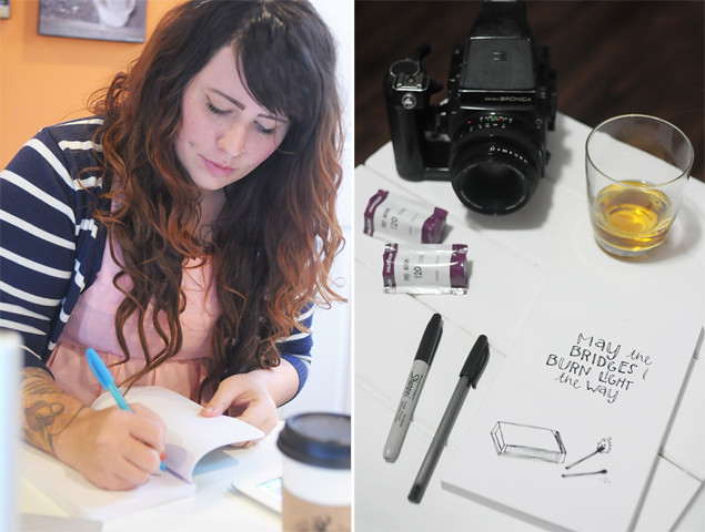
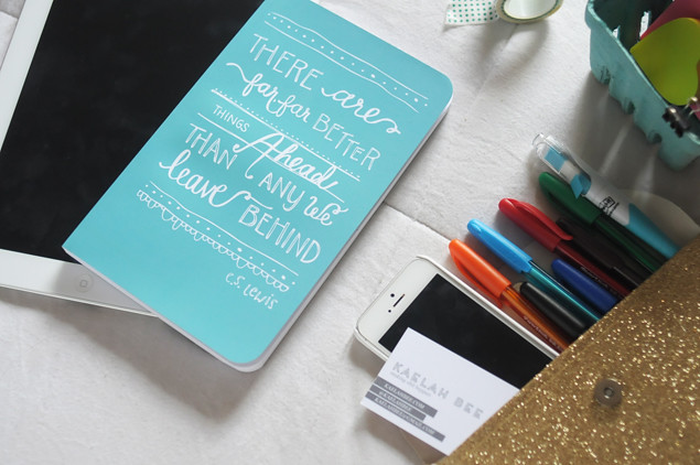
Kaelah Bee x DENIK Journal Collaboration - KaelahBee.com
I've been pretty excited to share this news for a while now! A few months ago I designed two notebooks for an online brand called Denik. One of the reasons I was so drawn to this partnership is because Denik takes a portion of each book sale to build schools around the world. This year Denik is building a middle school in Mali, Africa! Check out their current non-profit partner Mali Rising. From Denik: "Our belief is that art can change the world, a mission we wish to accomplish through the betterment of education." 

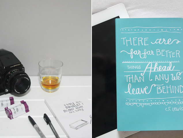
I chose to do two different styles of notebook in order to appeal to a wider variety of people. The first one I settled on is a hand-drawn layout of a C.S. Lewis quote. I really love this quote because I feel like it can apply to so many situations. I'm a firm believer in looking ahead and moving forward. This little turquoise notebook has become the one spot where I write down all of my goals! I've only had it for a couple of weeks but I love being able to look back at my goals (and intentions!) from the first few days. It's nice to see which goals I met and which ones I'm still working toward (and maybe which ones are no longer a priority.) The color of the notebook is just so dreamy, too!

The second notebook I designed is also hand-drawn. I opted to go slightly less twee with the second one haha. I did a rough illustration of a matchbox and matches with the phrase "May the bridges I burn light the way" - I kind of really dig that sentiment. I think it's a counterproductive to hold onto people and things that hold you back or stand in your way. Now I'm not saying you should blow off everyone and go on a ladder-climbing rampage or anything haha! I just think you should do what you need to do, ya know? A fun little feature on this notebook is that the back cover is a gorgeous orange color! (And there's even a little match on the spine, too)

My favorite feature of the notebooks is their soft, milky cover. It seriously feels like butter. The inside features 200 pages of 75% recycled (blank) paper. It's perfect for jotting down ideas, sketching out plans, or taping in receipts and ticket stubs that you don't want to lose. They're both softcover notebooks and they've even got my little graphic on the back! Fancy! All Denik journals are produced in the US.

Both of the journals I designed for Denik are now available to purchase on their website. Any profit (5%) I earn from the sale of these notebooks will be donated to the Middle Tennessee non-profit no-kill animal shelter Happy Tales Humane. Thanks for letting me share my excitement! Hopefully you'll see a design that you dig (even if it isn't mine!) xo
Kaelah Bee x DENIK Journal Collaboration - KaelahBee.com

// Recent Design Work

Here are a few recent design projects that I've worked on. I always forget to round them up and post them here, but I'm hoping I'll get better at it (starting now). Something I've noticed about the work I've taken on lately is that most all of it is very minimalistic and streamlined. I try to pop in as much color as I can, then add a few signature elements, but other than that they're really clean and simple. I'd really like to do more work with textures and 3-D elements... Hint! If you're in the market... *cough* haha Anyway, here's what has kept me busy the past little while.
Design - KaelahBe
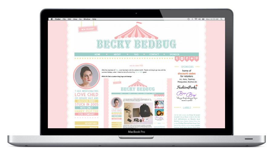
--- Becky Bedbug ---
Becky came to me a while back after seeing Ashley's blog design, and she knew she wanted pastels and a carnival theme for her new look. I was instantly in love with the color palette she sent over so I felt stoked to tackle her project. There are a lot of different elements to this design, though it's still really simple at it's core. (Excuse the Inception action with a layout inside of a layout haha!) I was really happy with how it turned out, but her reaction was by far the best part of the entire project. I love when I can grasp exactly what a client wants.
Design - KaelahBe
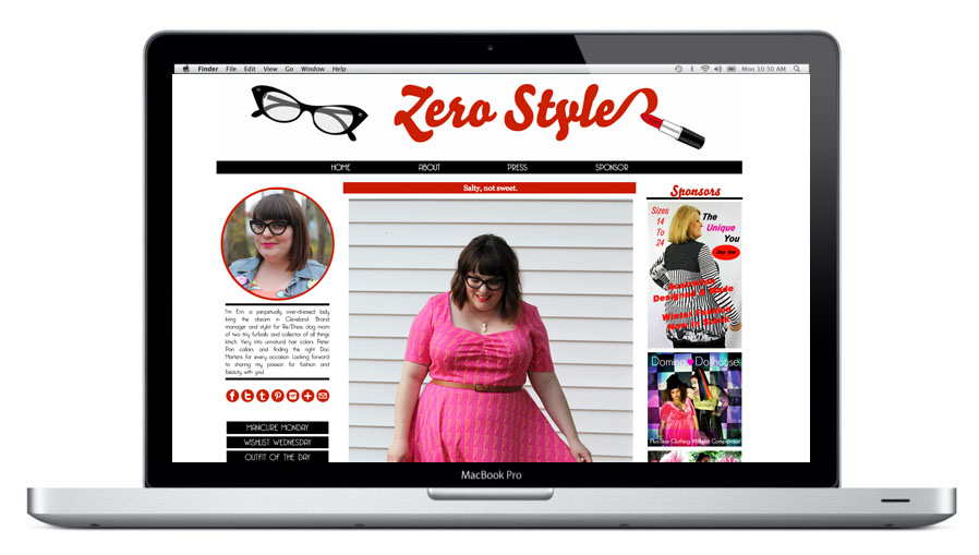
--- Zero Style ---
Erin has quickly become one of my favorite bloggers. She has so much charm and personality about her. It was such a treat to design a black and white (and red!) design for her that could show that personality. She wanted to incorporate her signature cat eye glasses and red lipstick, and we did just that! She's such a rad gal.
Design - KaelahBe
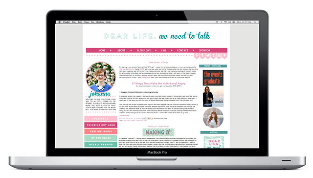
Johanna wanted clean lines and a bevy of fun colors. I created a custom herringbone background for her, too, and she has the ability to pop it in and take it out when she'd like. Originally it was a 3-column layout (as featured) but she later tweaked it to a 2 column to allow for larger images in her blog.
Design - KaelahBe
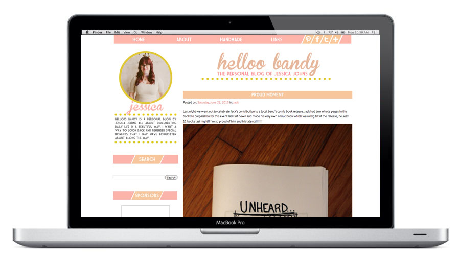
--- Helloo Bandy ---
Jessica wanted some light peachy/pink colors and a whole lot of white. That's easy enough! We used a slight pop of mustard yellow to bring out the warmth in the tones, too. Her blog allows her the ability to use really large images as the focal point of each post.

Design - KaelahBe
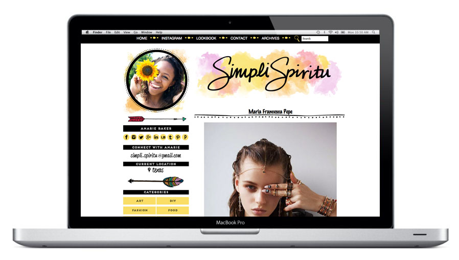
Ahhh. This blog! This blog was a labor of love (and sweat and tears and curse words and thrown objects and and and) haha Amarie came to me a while back and wanted to get something fresh and "boho" for her blog, and her timeframe was short. She sent so many mocks and requests and ideas to me that it was almost hard to manage honestly. So many sampled pieces from various sites and blogs, but we were able to design and code it to make it her own. The floating nav bar was by far the most stress-inducing task, but it got done! The name and all of the graphics are hand drawn, and I love the watercolor. I love using watercolor whenever a client is up for it. Amarie was gone overseas for a few weeks so the project got pushed around a bit, but at the end of the day I'm really happy with what she and I were able to accomplish. Amarie was so kind and considerate during the whole process. I love when clients are just so sweet! I learned quite a bit, too!

Design - KaelahBe
Rebecca wanted to amp up her Wordpress blog with a simple header featuring a new logo, and a matching business card to boot. She wanted something fun and colorful to match her personality and I'm in love with the final result. The type and flourishes all hand drawn, and the hot pink is by far one of my new favorite colors to design with. Rebecca has impecable taste in clothing and I love seeing the items she puts together.

♥ ♥ ♥ ♥ ♥ ♥ ♥ ♥ ♥ ♥ ♥ ♥ ♥ ♥ ♥ ♥ ♥ ♥ ♥ ♥ ♥ ♥ ♥ 

I'm still (always) accepting new clients of course. I have a set "all inclusive" Blogger package, as well as an a la carte option available for any platform. Due to our travel schedule for July I'll only be able to take on a small handful of clients for the month. If you're interested in chatting about a new blog design or logo, business cards, etc, please don't hesitate to email me! I'd love to work with you. Happy Sunday! xo
PS; I'm thinking about taking a few past designs that I've done for myself/for fun (including this one) and making them available for purchase as a pre-made template. Would any of you be into that? They'd be significantly cheaper than a custom job, but still well made and installed for you. Let me know if you'd be up for that and I'll try to get some up soon!
// Uniqueness of Being - Blog Redesign

Uniqueness of Being
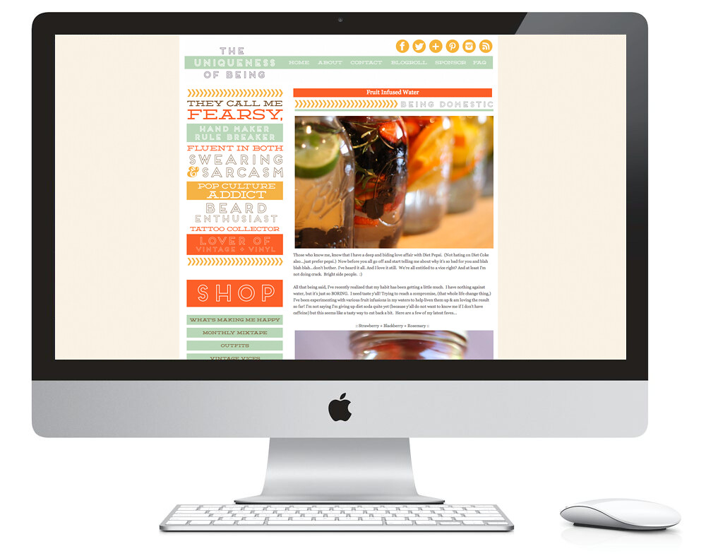
It's not very often that I share a single design project on it's own, but since it's become such a large part of what I do each and every day, I thought I should put more emphasis on sharing it here. This blog overhaul is one that I finished last week and installed for Ashley. She's a super fun, energetic gal with exquisite musical taste (I realized how much we had in common as I installed her blog design! Yes, I'm saying I have excellent taste in music haha I'm a little biased though so...) 

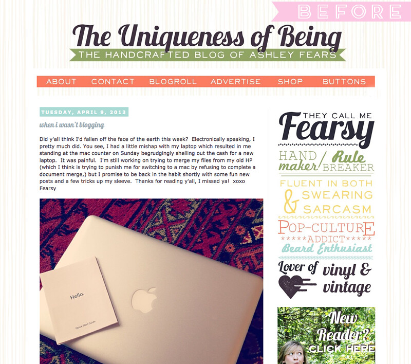
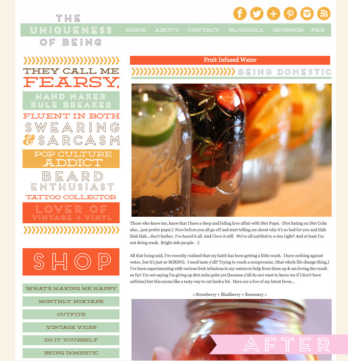
When Ashley first sent in her questionnaire, I'll admit: I was nervous! She took it to heart when I said "Please be as detailed as possible with your answers". Normally I say that because otherwise I get clients who just say "I don't know, just do something" (then they hate it! haha) BUT, Ashley's ability to think out exactly what she liked/didn't like proved so helpful! She shared a private design moodboard with me on Pinterest and I was immediately drawn to a particular image. It had a few of the colors Ashley said she liked, so I just ran with it. She also knew exactly what typefaces she liked so that was a huge help, too. I sent over the first mock and that was it! I can't tell you how rewarding it is to just "get it" right off the bat. Doesn't happen all that often, but I think Ashley and I really clicked on this one. I had so much fun designing this and if I do dare say, I think it's my very favorite design yet. The retro color palette and font choices, the heavy typography in the sidebar's About Me, and the simplistic header and navigation... swoon! I told Mike I wouldn't be the least bit upset if she hated it because I'd totally put it on my blog! (That's how this current LCH design came to be!) 

Here's a peek at the before and after if you're interested. You'll have to visit Ashley's blog to get the full feel for it, but I have a feeling you'll love her and you'll stick around for a while!
Before Redesign
After KB Redesign
If you're interested in a blog overhaul, brand redesign, or a fresh start for your indie biz, feel free to give me a shout! I'd love to work with you! I'm wrapping up some projects now and will have some availability later this week! It'd be fun to showcase the journey from start to finish!

// Kaelah's Closet + Mini-Design Update

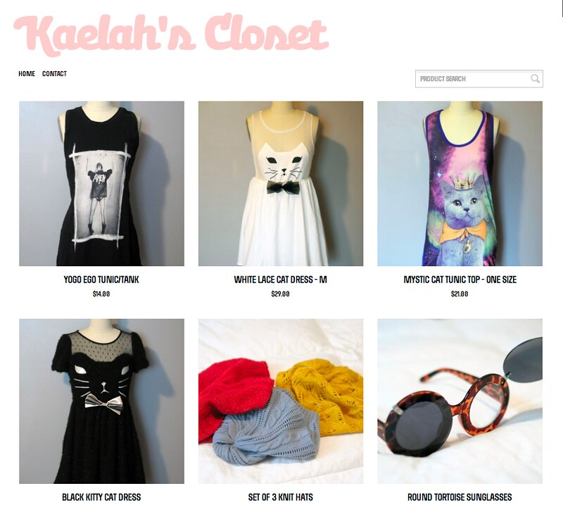
Hey friends! Happy Wednesday :) I wanted to pop over and tell you all that I just added 76 new items to Kaelah's Closet last night. I tweeted out the link around midnight and several of the items are already gone, but if you're keen to take a look, feel free! A lot of them still have their tags on them... which is kind of shameful. I have even more to get rid of and list over the coming weeks so stay tuned. From here on out I'm buying with intention, not just because something is "so cute!" It just ends up getting lost in my closet anyway.
I've already been asked dozens of times, but yes, I do ship internationally. Just pick international shipping at checkout. (Please note that there was a recent USPS price increase for international shipping!) If there's an overcharge for shipping, I'll gladly refund it once I have the receipt!

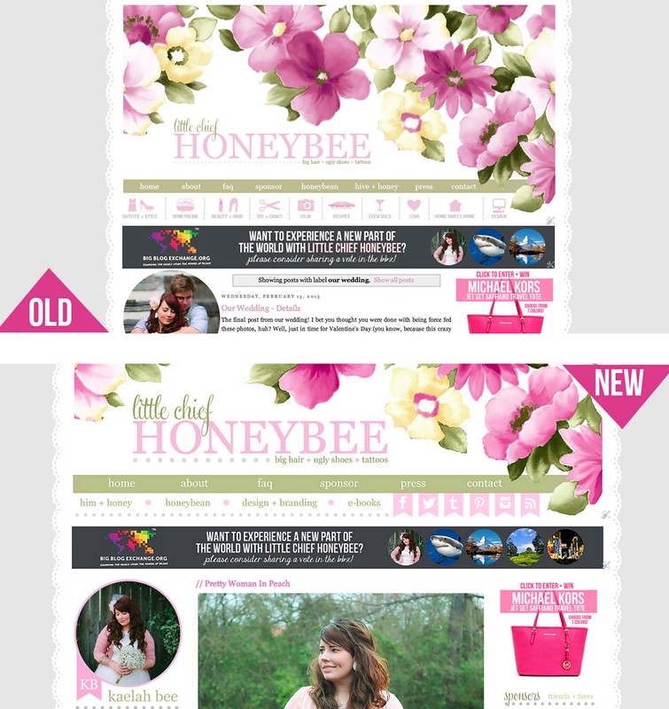
Also worth noting: I gave LCH a mini (tiny, itty bitty) facelift last night, too. Just the navigation and sidebars mostly. I also cut off a bit of the header so it didn't take up the whole page, and then I made the blog about 200 pixels wider so it didn't feel so cramped. I went through about 50 posts and resized the images (UGH!) but there's still 1750+ to do! You'll notice a "//" at the beginning of edited blog post titles. That's just my way of keeping up with what I've edited already. 
update
I know the pink of the sidebar feature headers is a little light for most people - I'll be tweaking things like that over the coming days. I'm hoping to really organize this messy, messy blog! I'm also working on several supporting pages so hopefully those will go live/be apparent soon. Can you see a huge difference in the graphic color quality? In the header, especially! I swapped everything over to Flickr and now my images look like they're supposed to! I doubt I have it in me to reupload and edit all 1800 posts, but I'm going to do as many as I can. From here on out I'll be hosting on Flickr, even though the extra steps are super lame haha.

Until next time, feel free to check it out and shop Kaelah's Closet! You can always tweet me if you need info on an item (@kaelahbee).

Oh! I am also accepting sponsors for April + beyond! Check out the stats + traffic, then shoot me an email if you'd like to see rates + sizes! The PRIME ad for April has already sold, but I'd love to get you on the list for May! I have plenty of XL ads left, too!

// Recent Design Work

Today I thought I'd round up a handful of projects from the last several weeks to share. Trying to juggle design work on top of moving and renovating was a bit difficult, but I'm glad to be back in the groove. I was surprised how busy I stayed with design work over the holidays, especially when I was considering scaling back to rehash all of my ideas. I'm still in the phase (aren't I always?!) but I have a more clear-cut vision of what it'll entail, and of course I'll be sharing that before too terribly long. (I always seem to have something to unveil... I promise it's not that exciting haha) Anyway, here's what I've been up to:
EVERYDAY BABY + EVERYDAY AXNESS
[brand identity + print + blog overhaul]
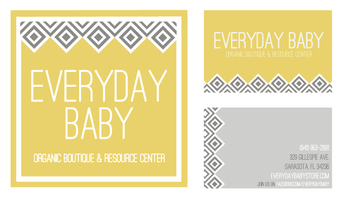
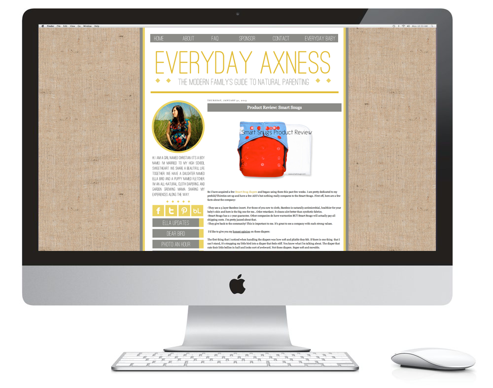
I worked on a blog overhaul of Christian back around the holidays. She wanted to really focus on organic textures and have a "natural" feel about her blog while still keeping it really simple. She really liked clean, thin typefaces and wanted to have a large content area. This is what ended up coming of that. She's currently in the midst of opening an organic baby boutique and I was honored to play a role in the brand identity portion. She wanted something that was cohesive with her blog, but could stand on it's own. Since Everyday Baby didn't have a mark of any sort, we decided to play up the geometrics of her header in a slightly more graphic manner. The logo will also be a 2'x2' exterior sign on the storefront. The two pieces on the top right side are her business cards. I can totally see the graphic pattern being used on tissue paper and hang tags for the store. I'm really excited to see what comes of Christian's venture!
ALEXIS' GYROS + GRILL
[brand identity]
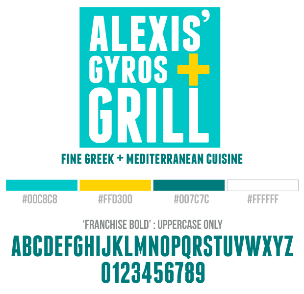
Alexis first contacted me about a blog overhaul, but then decided to put it on the back burner to focus on her new foray into the food truck world. She's also the one who inspired me to give gyros a go! (We still haven't ventured over since the good places are so far away, but it's on the schedule!) The initial logo we had worked on a bit was totally different from this one -- more of a detailed badge style. Once I sent over this more modern, upscale mock, we had a hard time deciding what would be a better fit for a food truck like hers. In the end, she opted for the more clean-cut look with the bold colors, playing up the square edges and the intersecting lines of yellow mark. I can't wait to see how it translates onto the truck! 

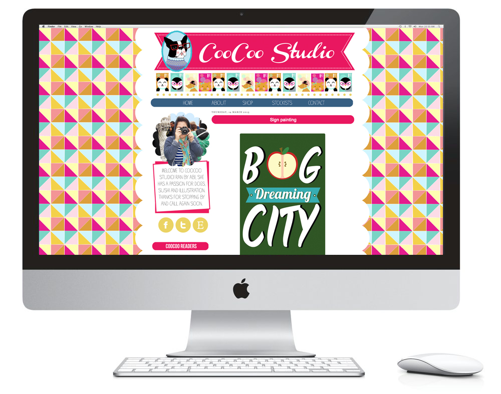
COOCOO STUDIO
[blog overhaul]
Abi's blog was such a treat to do! I'm a fan of color, but this girl lives for color! I don't think I would have ever thought to propose such a wild and playful background, but that was all her doing. She knew what she wanted and I was just there to fill in the little pieces along the way. Abi's illustrations are so lively and sweet. She wanted to really show that in her header, so we did just that. She wanted to keep the rest of it pretty minimal, but she had to have the scalloped edges. I think if you were to pay her blog a visit, you'd see just how perfectly it fits her style. 

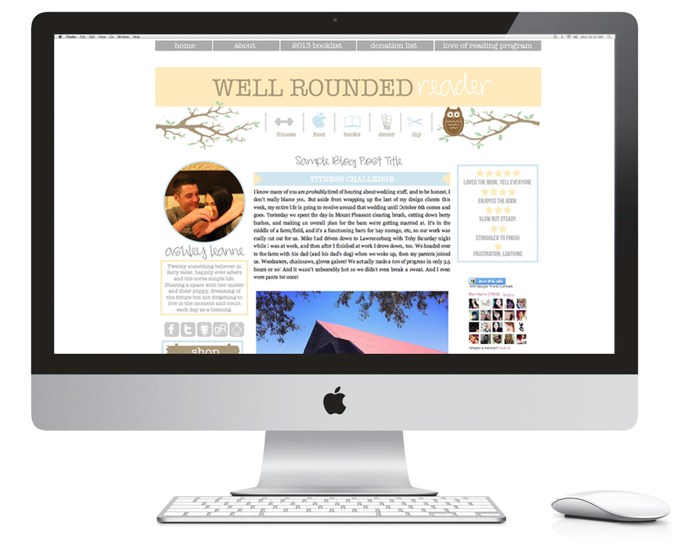
WELL ROUNDED READER
[blog overhaul]
Ashley's blog design was fun to do because of the details she wanted to incorporate. The branches, the owl, multiple navigations and the prominent rating system for her book reviews. She wanted to focus on keeping the colors muted, but still happy. It's the perfect chilled atmosphere to feel relaxed when you're reading about... well, reading!

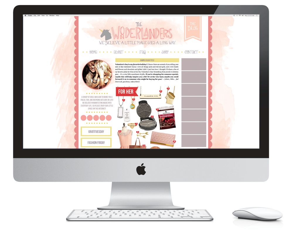
THE WONDERLANDERS
[brand identity + blog overhaul]
Emilie is an old LiveJournal pal of mine and she is currently getting ready to launch a new online boutique for women and she wanted both a logo and a blog to set the stage. Above is the blog design mock (currently being installed + filled with original content). Emilie likes to play up the whimsical side of things and opted for a crown mark for the logo, and a unicorn for the blog. She was fond of the hand-drawn letters I made for one of my past blog designs so I tweaked it and used it for the header. She also liked the lightness of the watercolors because it still provides a little bit of gravity behind the content area. I think my favorite part is the buttery yellow color that acts as an element of surprise against the rest of the mauves and pinks. I'm excited to see how this one fully comes alive once it's launched! I definitely want to do more work with watercolors.

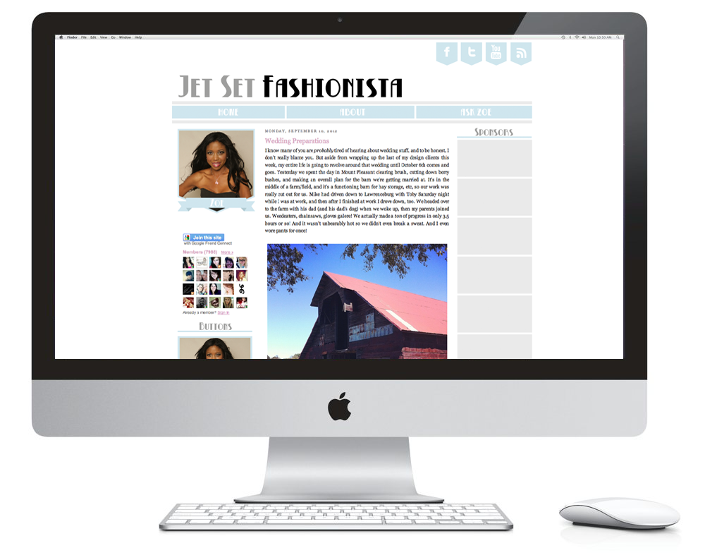
JET SET FASHIONISTA
[semi-blog facelift]
Zoe wanted a fresh slate to launch her new blog, but didn't want to go hard and heavy with all of the bells and whistles. She opted for a half-package which included enough visual perks to lay out the land, but also gave her enough breathing room to grow into something naturally. She was very certain that she wanted a very clean, minimal look so that her content could really shine.

SUGARBEE
[blog overhaul]
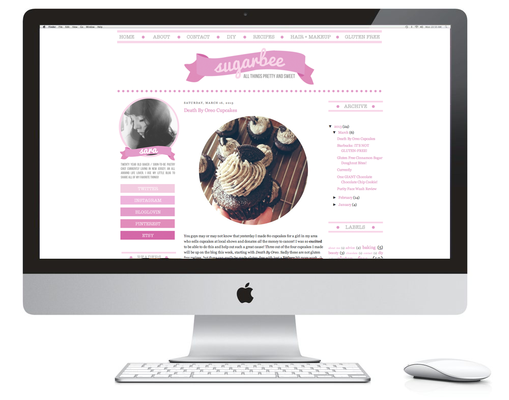
Sara's blog was one of my favorite ones to do simply based on the colors and the visuals. She's a 20 year old pastry chef who documents her foodie adventures on her blog. I'm a sucker for ombre sidebar navigations so I'm glad she was into that as well. She doesn't like a cluttered sidebar so the outer columns remain light and airy. Her sharable blog buttons are some of my favorites just because they're happy buttons. Not even sure that makes sense, but the vibe of the whole thing is so great. She's such a sweet gal, too!
♥ ♥ ♥ ♥ ♥ ♥ ♥ ♥ ♥ ♥
Overall I've been really happy with the clients I've had lately. I've been itching to do more identity work and print, too, but I'm just happy when I get to work with people who jive with my style. (Yes, I totally said jive. I know.) Sometimes the overly-cutesy stuff can be a real turn-off for some, but I like that blog and identity work allow me to balance the two. Each and every designer clearly has his/her own style, and a good designer can adapt to suit the desires of the client, but it's great when someone seeks you out because they feel like what you do speaks to them in some way. You can't be everyone's cup of tea but the best kind of work is the kind you enjoy!

With that being said, I'm wrapping up my last open project today and I'd love to work with some of y'all if you're on the hunt for blog facelift, identity for your indie biz, or even just some blogging business cards! I've revamped my offerings and I'm happy to custom tailor packages to suit whatever needs you may have. If you're up to chat, shoot me an email [kaelahbee at gmail dot com]! I'd love to hear from you! Hope you have a great week!

PS; Some of the showcases above are the mock sites - they have placeholder blog posts and sidebar content to show the design's intention.

PPS; I get quite a few emails re: freelance design, and small biz owning in general. I was thinking of doing a blog post (or series) dedicated to answering these. If you have anything specific you'd like to ask, please feel free to leave it in the comments. You can always email it to me, or leave it on my FormSpring (I know, so 2009) if you'd prefer to be anonymous. I'm certainly no expert, and probably not all that qualified to be giving advice, but I can speak from my personal experience!

Design Recap

I feel like every single one of my posts just constantly talks about how busy I am or how I can't find time for anything. While I do have busy days, it's hard to talk about them knowing that most all of it goes on behind the scenes and you don't see it. Most of you probably think I just sit in my closet office and twirl my hair all day. (Sometimes I do... but mostly out of designer's block!) Well, here's a little showcase of what I've been up to the past 2 months. I shared a design recap back in February, but I like to showcase these not only to show what I've whipped up, but to also give you some fun new blogs to add to your blog roll! I try to keep myself busy with several clients a week, and I've only caught up this week. But I thought it was prime time to show you some new reads (and share just how many people love the color mint... and scallops!)

And I'll go ahead and apologize for sharing TWELVE designs at one time... I should never do that. I was going to break it up into 2 posts but what the hey?! Here you go! ;) You'll only get the full experience if you click over so go check them out in real-live-view!
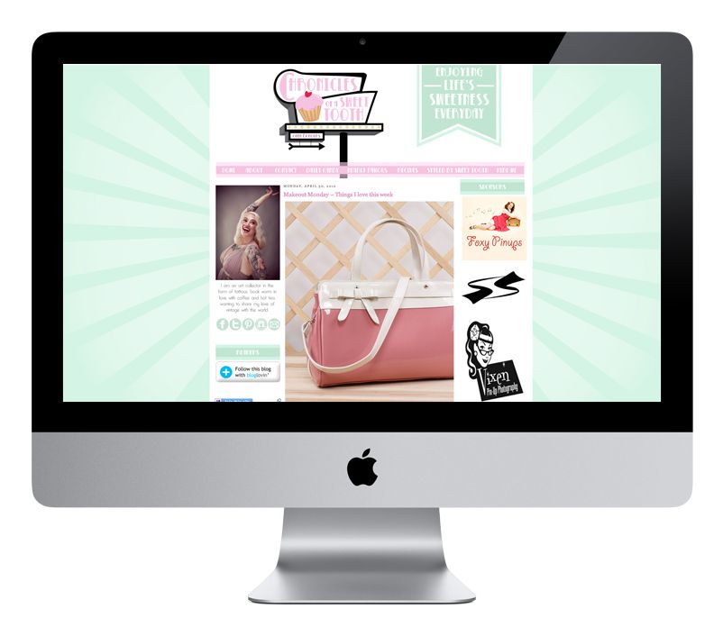
Chronicles of a Sweet Tooth
I did Kem's last blog design last year, and this spring she was ready for a revamp. Kem is such a doll. I love her blog because it's the perfect mix of girly, badass, rockabilly and pinup fashion. We did a retro illustrated sign at the top and played up a pink and mint color combo with light flares in the background.
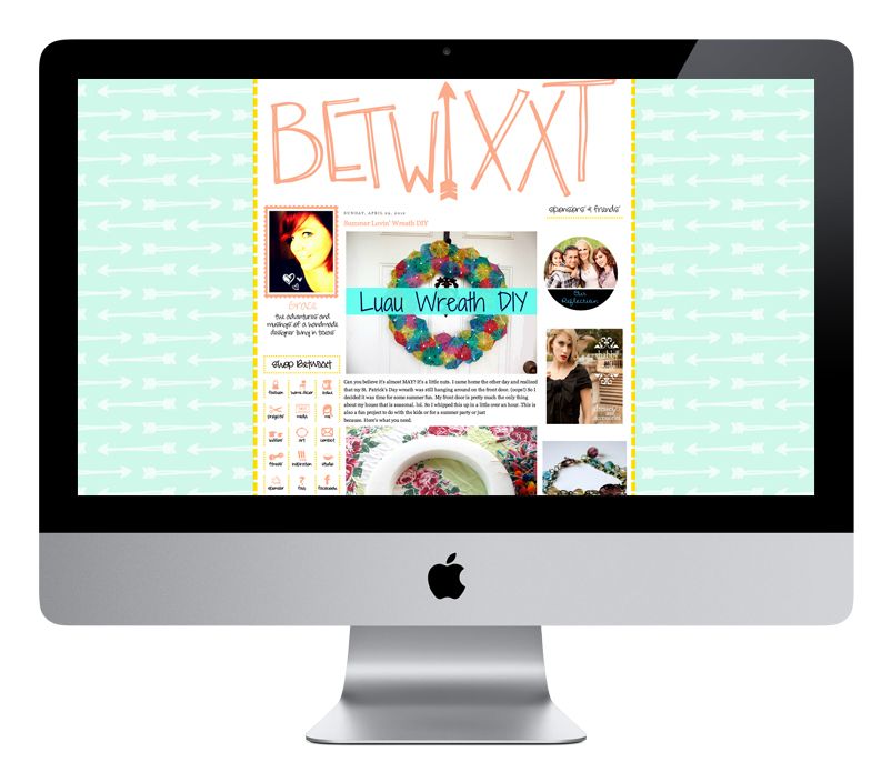
Betwixxt
Grace is a long time sponsor here at LCH and has grown into a totally rad friend. I also did her last blog design last year, and this time around we went for a more hand-drawn look. It was fun to doodle some arrows and her blog name over and over and over. Sounds monotonous, but that's what I totally love doing! We kept most of the same colors overall, but swapped the fuschia for a coral!
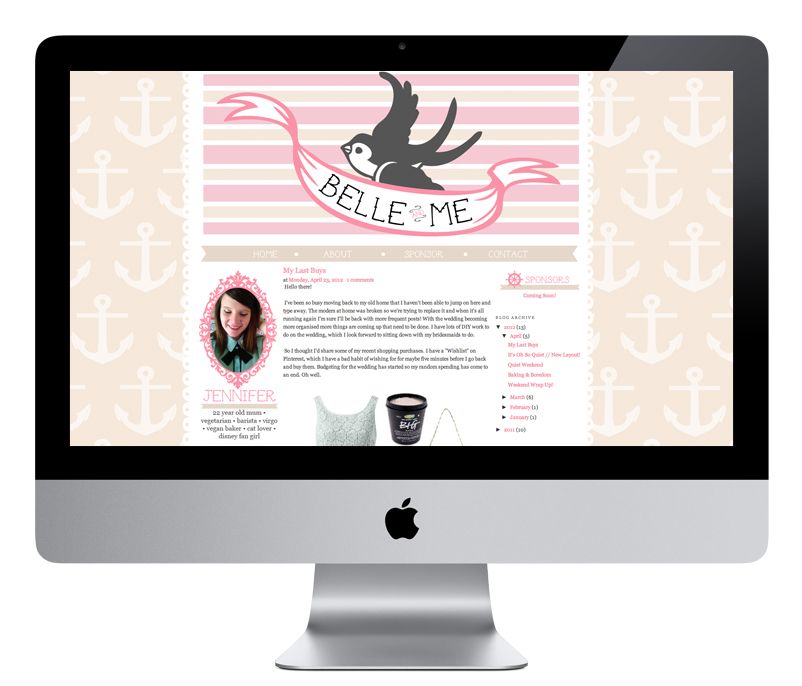
Belle and Me
I loved doing this sweet feminine/Sailor Jerry design. It took us a few tries to get the header perfect but we settled on a simple swallow and banner, with a punch of pattern in the background. You'll find little graphics scattered around like a ship's wheel and a nautical compass. I love the creamy tan with the pink!
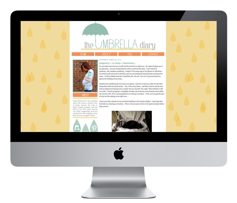
The Umbrella Diary
I love designing a brand new blog for a brand new blogger. When someone dives in head first with a totally custom design, I can't help but watch the story unfold! Amber is preparing for her little bebe and we did an umbrella theme for her blog... because duh, it's called The Umbrella Diary! These were colors I am totally not used to working with, but I love working out of my element.
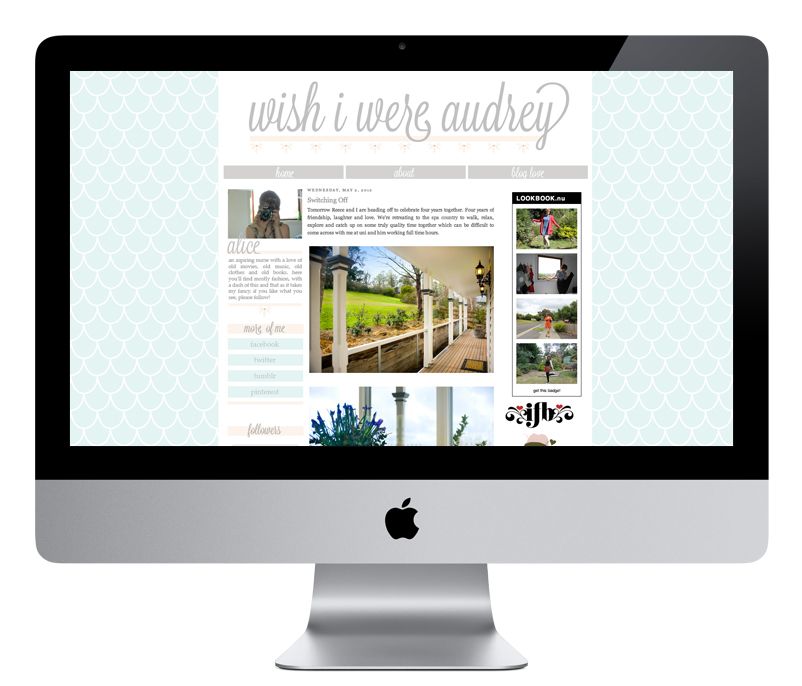
Wish I Were Audrey
Alice's blog just exudes class. How can it not with a name like that?! She pretty much left the entire design up to me and I was so tickled when she loved absolutely everything in the first mock! I feel like that doesn't happen all that often but I've had a slew of incredible clients here lately! They make me love my job. 
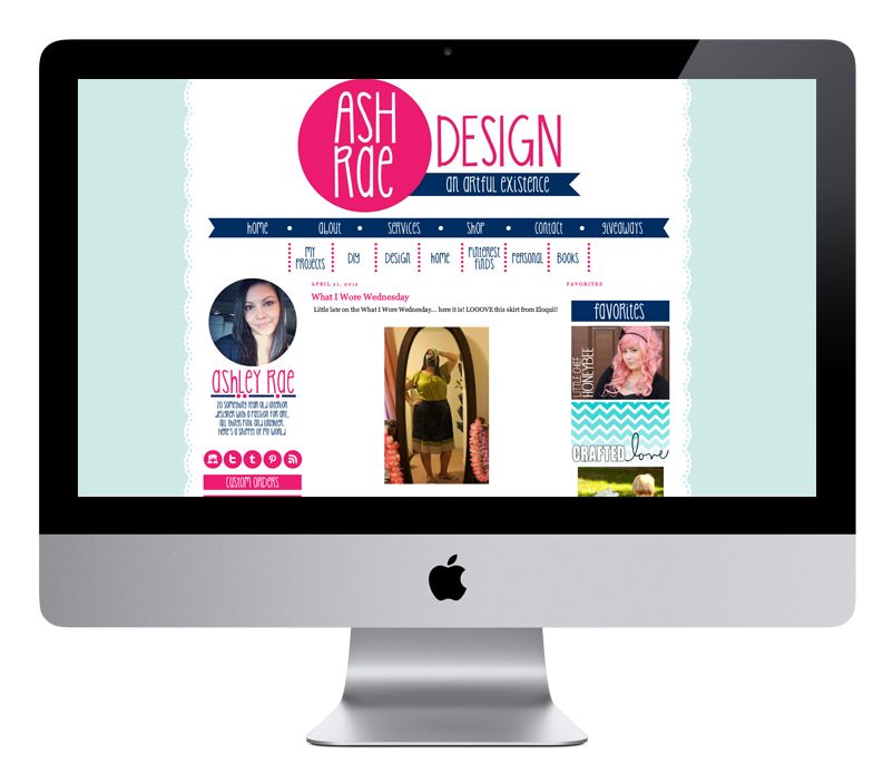
Ash Rae Design
When Ashley first sent me her color swatches, I went white in the face. Not because they were bad or anything, but because I had never worked with a bright lime green before! With fuschia! After a few trial and error color combos, we settled on a mint/baby blue and navy/fuschia. The background you see on here is actually one from a template I designed for my (still to come) shop!
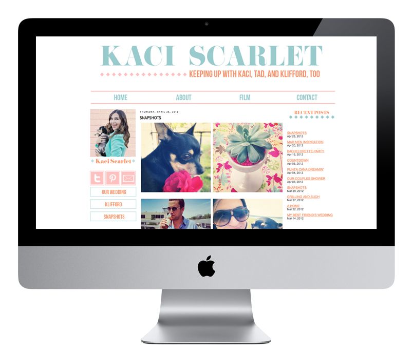
Kaci Scarlet
This is one of my most recent favorites. Everything about it is simple and clean. Again, not something I'm normally used to. The blue, coral and pink color combo has totally won me over and I kind of sorta want to use it on everything!
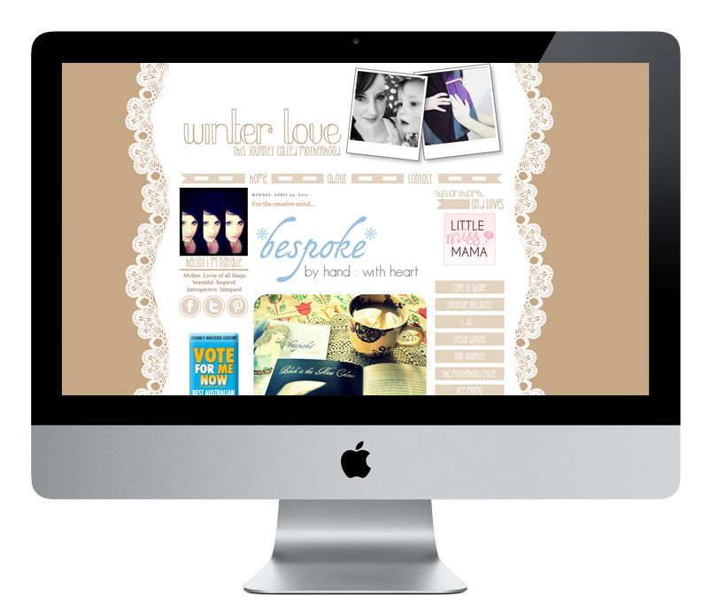
Winter Love
This blog design makes me think of coffee. Undeniable. And perhaps that was because I designed and coded the whole thing while sitting in a coffee shop here on the East Side. It's a little bit different from what I normally do but I loved Natalie's vision and I was so happy to take part in it.
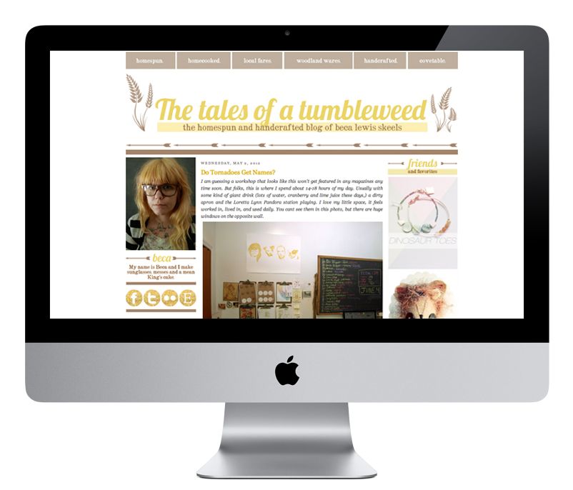
Tales of a Tumbleweed
This is my most recent design... only coded and installed about 2 days ago! Beca is one of my favorite people in the world and I was delighted at the opportunity to give her a new creative space. She's one half of the mastermind behind the Tumbleweeds wooden sunglasses! I'm so glad she ended up loving what I made her!
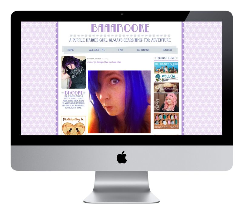
Baaarooke
A purple on purple on purple blog design for a purple haired girl? Um yes! She recently went blue, but I had loads of fun with this one. From little details here and there, to the gradient in the colors, I like this one lots!
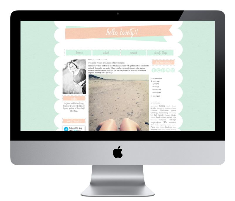
Hello, Lovely!
Another recent one from just this past week. Jordan recently revamped her blog from being just about baking to being more of a lifestyle destination. She wanted scallops and mint... so scallops and mint I gave her! It's simple but classy, and I think that's totally representative of Jordan's aesthetic!

Dermie Pie
This week I also designed a new header for Andrea. She wanted something that was more encompassing of what you'd find on her blog. We decided to go the route of a recipe card, some fun illustrated glasses, flowers and baked treats. Yum!

♥ ♥ ♥ ♥ ♥ ♥ ♥ ♥ ♥ ♥ ♥ ♥ ♥ ♥ ♥ ♥ ♥ ♥ ♥ ♥ ♥ ♥ ♥

Right now I focus mostly on vector based designs, but I'd really like to work more on texture and raster based work. Illustrator will always be my favorite, there's no denying that, but I'd like to get a little more variation in my portfolio. I'll gladly design whatever it is that the client wants, no doubt, but I do still think I've worked myself in somewhat of a corner with my aesthetic. Is it crazy that I've had this blog design for less than a month and I'm already dreaming up something new? New and totally different! We'll see when I actually get around to doing it!

With that being said, I'm completely caught up on clients, less the 2 I booked this week! I'm eagerly taking on more clients for the rest of the month and beyond, so if you're on the hunt for a Blogger makeover, please don't hesitate to email me! (kaelahbee at gmail dot com) We can chat rates, specifics, inspirations... My turnaround time is incredibly quick when we work together! (If you don't get a response from me this weekend, you'll get it on Monday! Not sure how much internet I'll have. I'm looking forward to stepping away!)

If you want something simple, handdrawn, and/or completely different from what you see above, don't let that stop you from reaching out. I'm eager to try new things and do something different. I ultimately think your blog should be a reflection of you. You should be inspired by it! You are the one who has to write in it... no one else! Make sure you feel good about it.

We're headed out of town for the weekend to celebrate Mike's birthday! He's a Cinco de Mayo boy so everyone likes to drink tequila and eat Mexican food in celebration of him, right? Right! I'll still have goodies lined up for you this weekend. Be sure to check back tomorrow as the giveaway is kind of rad! xo