Showing posts with label design. Show all posts

// Spotlight: Beth Hoeckel Collage + Design


I was on the hunt for some astronomy-related artwork for Baby Flynn's nursery when I first stumbled upon Beth Hoeckel's collage work on Society6. It was totally the plethora moons and starscapes that drew me in, but it was her amazing use of texture and vintage elements that kept me there. Collages are definitely one of my favorite art mediums, probably because they seem so simplistic but I surely think a lot of planning and thought must go into them. I know I've tried my hand at a few and failed miserably haha! I love the balance that Beth manages to get with her work. The soft, sandy pinks with the high contrast black and whites. The feeling of "the future" when looking at the space ones coupled with the heavy, dark feeling some of the others give off (ballerinas and lightning, anyone?) I know I'll definitely be nabbing a few prints to put in the nursery, but it'll be deciding which ones that proves difficult. There are so many space-themed designs to choose from!

All of these prints (and more!) are available in Beth's Society6 shop or her Big Cartel if you're interested. And if you're a creepy internet stalker like me (ha!) you can find her at these following links: site - tumblr - twitter - facebook.

// Uniqueness of Being - Blog Redesign

Uniqueness of Being
It's not very often that I share a single design project on it's own, but since it's become such a large part of what I do each and every day, I thought I should put more emphasis on sharing it here. This blog overhaul is one that I finished last week and installed for Ashley. She's a super fun, energetic gal with exquisite musical taste (I realized how much we had in common as I installed her blog design! Yes, I'm saying I have excellent taste in music haha I'm a little biased though so...) 

When Ashley first sent in her questionnaire, I'll admit: I was nervous! She took it to heart when I said "Please be as detailed as possible with your answers". Normally I say that because otherwise I get clients who just say "I don't know, just do something" (then they hate it! haha) BUT, Ashley's ability to think out exactly what she liked/didn't like proved so helpful! She shared a private design moodboard with me on Pinterest and I was immediately drawn to a particular image. It had a few of the colors Ashley said she liked, so I just ran with it. She also knew exactly what typefaces she liked so that was a huge help, too. I sent over the first mock and that was it! I can't tell you how rewarding it is to just "get it" right off the bat. Doesn't happen all that often, but I think Ashley and I really clicked on this one. I had so much fun designing this and if I do dare say, I think it's my very favorite design yet. The retro color palette and font choices, the heavy typography in the sidebar's About Me, and the simplistic header and navigation... swoon! I told Mike I wouldn't be the least bit upset if she hated it because I'd totally put it on my blog! (That's how this current LCH design came to be!) 

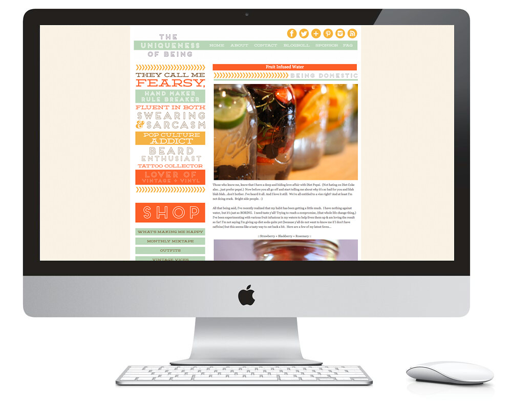
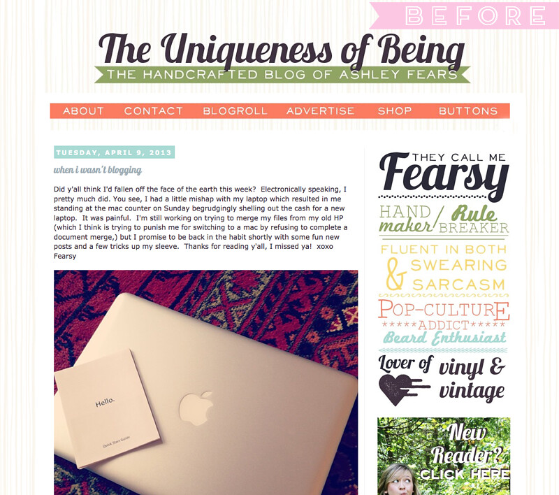
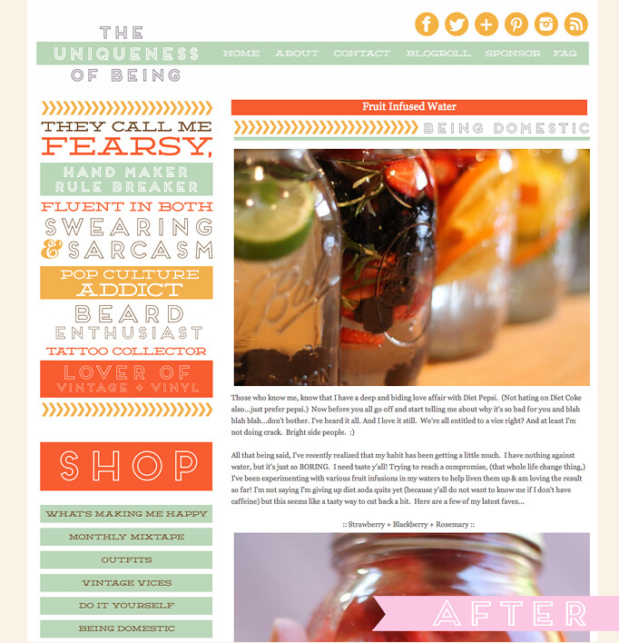
Here's a peek at the before and after if you're interested. You'll have to visit Ashley's blog to get the full feel for it, but I have a feeling you'll love her and you'll stick around for a while!
Before Redesign
After KB Redesign
If you're interested in a blog overhaul, brand redesign, or a fresh start for your indie biz, feel free to give me a shout! I'd love to work with you! I'm wrapping up some projects now and will have some availability later this week! It'd be fun to showcase the journey from start to finish!

// Recent Design Work

Today I thought I'd round up a handful of projects from the last several weeks to share. Trying to juggle design work on top of moving and renovating was a bit difficult, but I'm glad to be back in the groove. I was surprised how busy I stayed with design work over the holidays, especially when I was considering scaling back to rehash all of my ideas. I'm still in the phase (aren't I always?!) but I have a more clear-cut vision of what it'll entail, and of course I'll be sharing that before too terribly long. (I always seem to have something to unveil... I promise it's not that exciting haha) Anyway, here's what I've been up to:
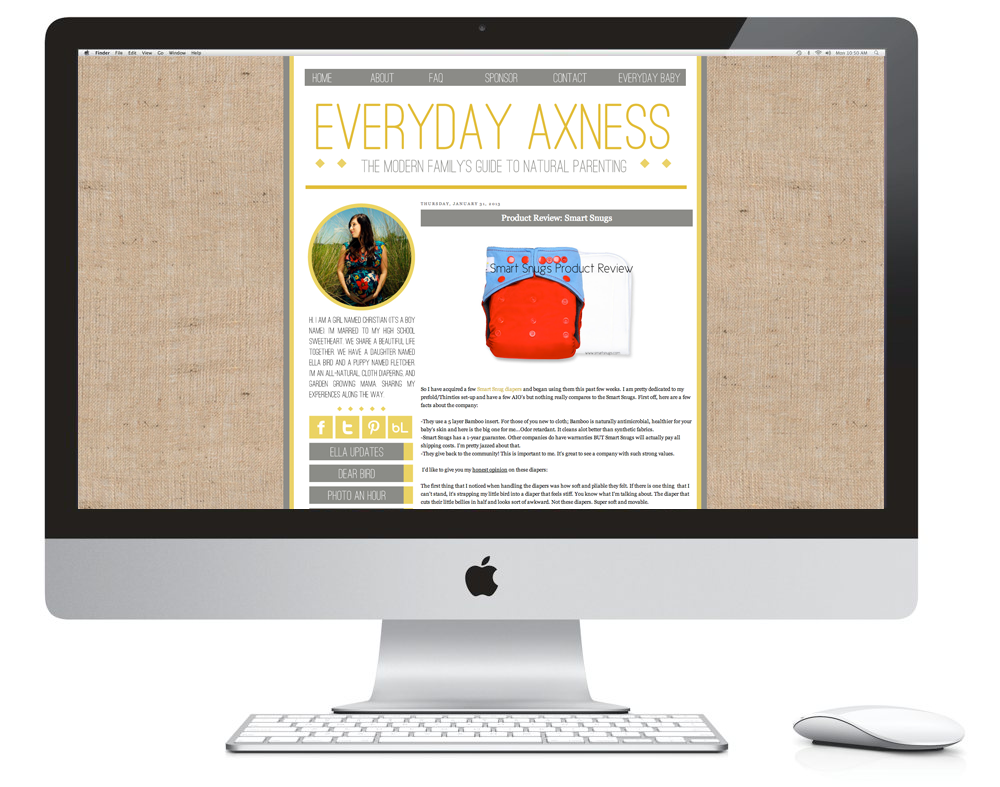
EVERYDAY BABY + EVERYDAY AXNESS
[brand identity + print + blog overhaul]
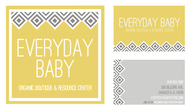
I worked on a blog overhaul of Christian back around the holidays. She wanted to really focus on organic textures and have a "natural" feel about her blog while still keeping it really simple. She really liked clean, thin typefaces and wanted to have a large content area. This is what ended up coming of that. She's currently in the midst of opening an organic baby boutique and I was honored to play a role in the brand identity portion. She wanted something that was cohesive with her blog, but could stand on it's own. Since Everyday Baby didn't have a mark of any sort, we decided to play up the geometrics of her header in a slightly more graphic manner. The logo will also be a 2'x2' exterior sign on the storefront. The two pieces on the top right side are her business cards. I can totally see the graphic pattern being used on tissue paper and hang tags for the store. I'm really excited to see what comes of Christian's venture!
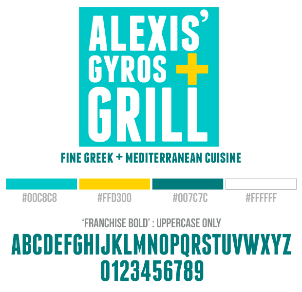
ALEXIS' GYROS + GRILL
[brand identity]
Alexis first contacted me about a blog overhaul, but then decided to put it on the back burner to focus on her new foray into the food truck world. She's also the one who inspired me to give gyros a go! (We still haven't ventured over since the good places are so far away, but it's on the schedule!) The initial logo we had worked on a bit was totally different from this one -- more of a detailed badge style. Once I sent over this more modern, upscale mock, we had a hard time deciding what would be a better fit for a food truck like hers. In the end, she opted for the more clean-cut look with the bold colors, playing up the square edges and the intersecting lines of yellow mark. I can't wait to see how it translates onto the truck! 

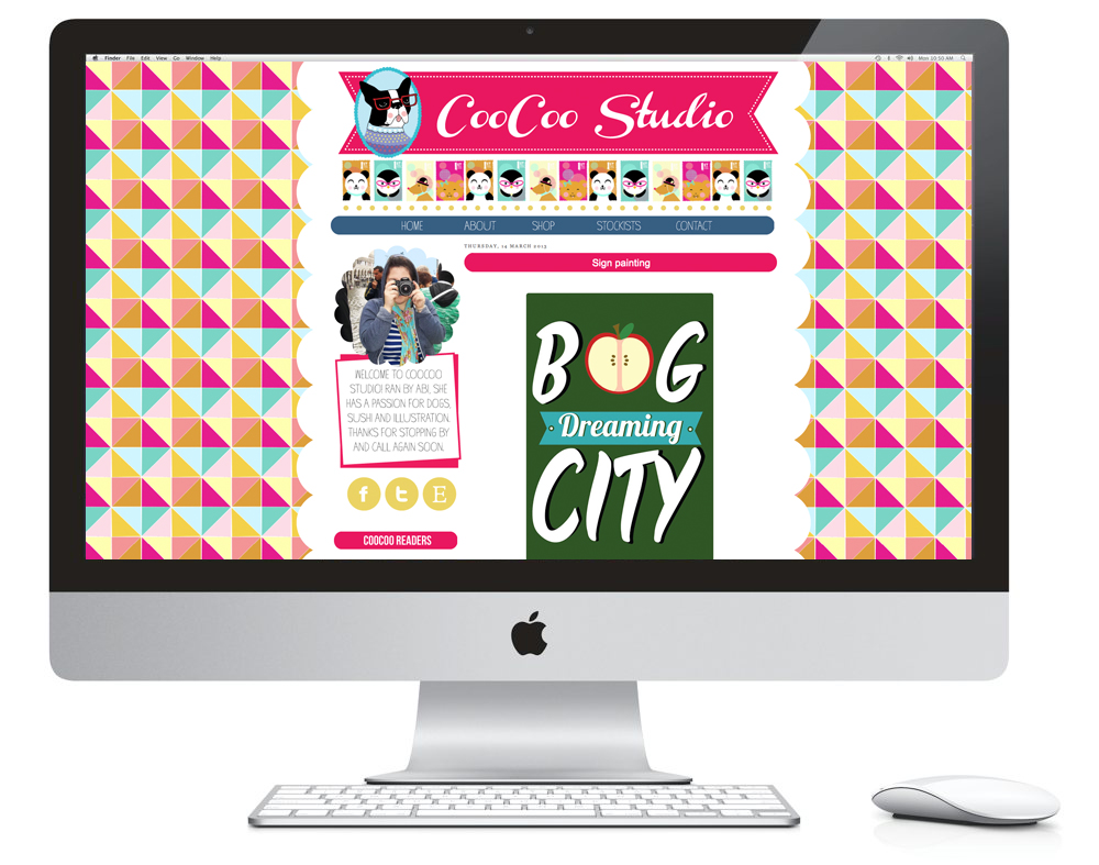
COOCOO STUDIO
[blog overhaul]
Abi's blog was such a treat to do! I'm a fan of color, but this girl lives for color! I don't think I would have ever thought to propose such a wild and playful background, but that was all her doing. She knew what she wanted and I was just there to fill in the little pieces along the way. Abi's illustrations are so lively and sweet. She wanted to really show that in her header, so we did just that. She wanted to keep the rest of it pretty minimal, but she had to have the scalloped edges. I think if you were to pay her blog a visit, you'd see just how perfectly it fits her style. 

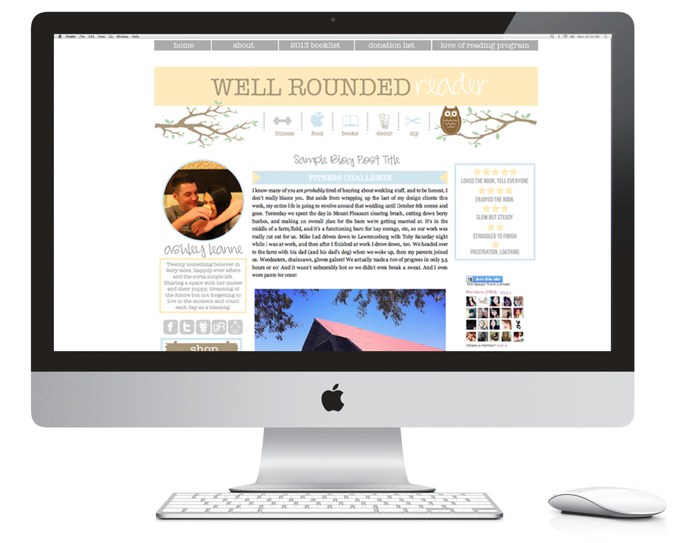
WELL ROUNDED READER
[blog overhaul]
Ashley's blog design was fun to do because of the details she wanted to incorporate. The branches, the owl, multiple navigations and the prominent rating system for her book reviews. She wanted to focus on keeping the colors muted, but still happy. It's the perfect chilled atmosphere to feel relaxed when you're reading about... well, reading!

THE WONDERLANDERS
[brand identity + blog overhaul]
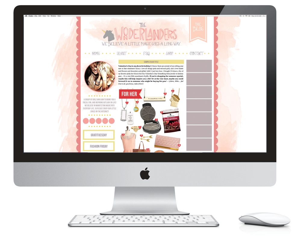
Emilie is an old LiveJournal pal of mine and she is currently getting ready to launch a new online boutique for women and she wanted both a logo and a blog to set the stage. Above is the blog design mock (currently being installed + filled with original content). Emilie likes to play up the whimsical side of things and opted for a crown mark for the logo, and a unicorn for the blog. She was fond of the hand-drawn letters I made for one of my past blog designs so I tweaked it and used it for the header. She also liked the lightness of the watercolors because it still provides a little bit of gravity behind the content area. I think my favorite part is the buttery yellow color that acts as an element of surprise against the rest of the mauves and pinks. I'm excited to see how this one fully comes alive once it's launched! I definitely want to do more work with watercolors.

JET SET FASHIONISTA
[semi-blog facelift]
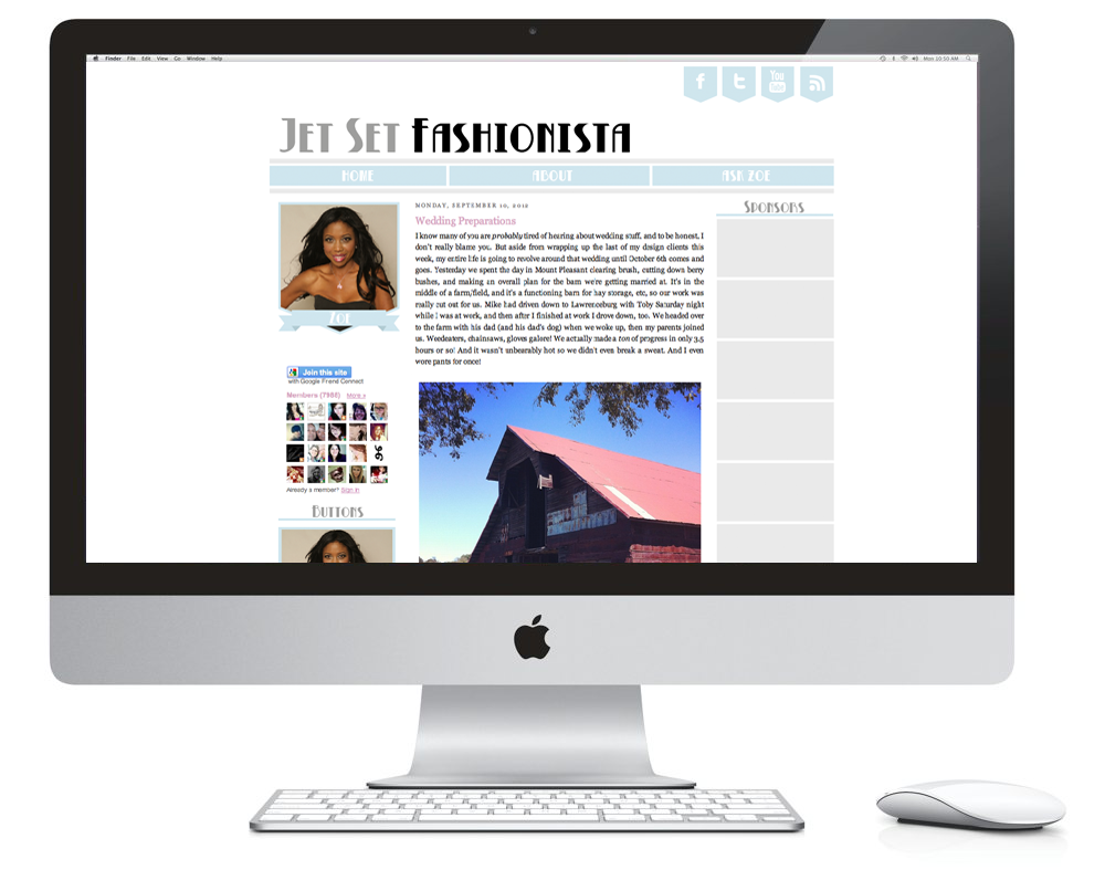
Zoe wanted a fresh slate to launch her new blog, but didn't want to go hard and heavy with all of the bells and whistles. She opted for a half-package which included enough visual perks to lay out the land, but also gave her enough breathing room to grow into something naturally. She was very certain that she wanted a very clean, minimal look so that her content could really shine.

SUGARBEE
[blog overhaul]
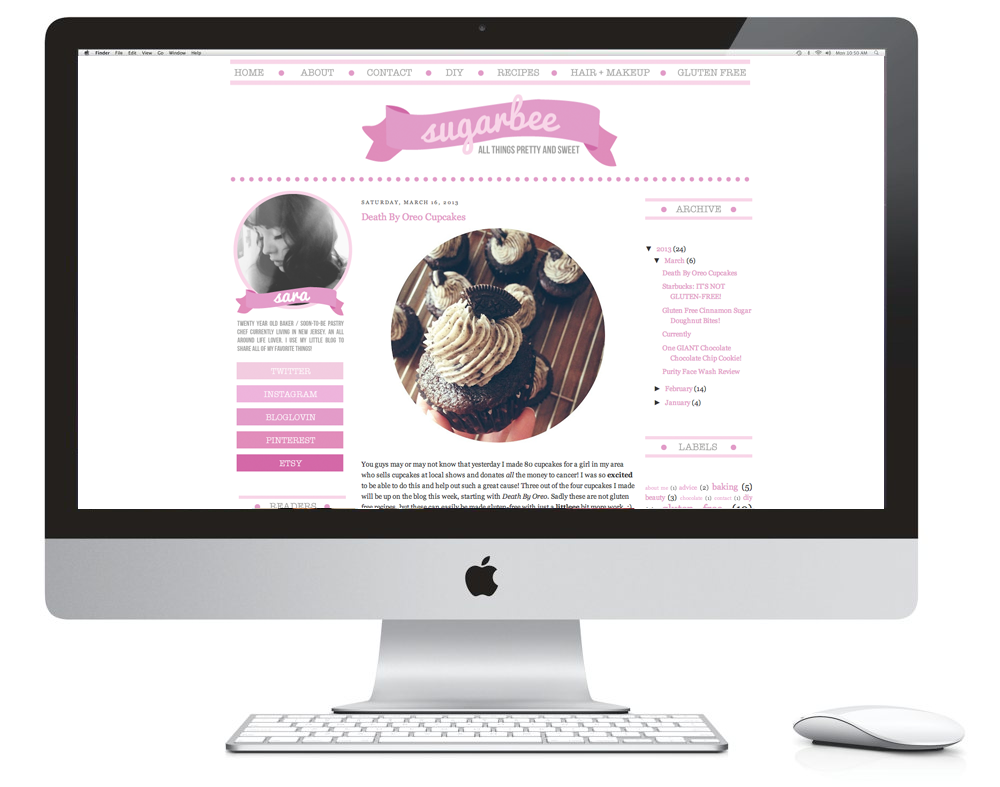
Sara's blog was one of my favorite ones to do simply based on the colors and the visuals. She's a 20 year old pastry chef who documents her foodie adventures on her blog. I'm a sucker for ombre sidebar navigations so I'm glad she was into that as well. She doesn't like a cluttered sidebar so the outer columns remain light and airy. Her sharable blog buttons are some of my favorites just because they're happy buttons. Not even sure that makes sense, but the vibe of the whole thing is so great. She's such a sweet gal, too!
♥ ♥ ♥ ♥ ♥ ♥ ♥ ♥ ♥ ♥
Overall I've been really happy with the clients I've had lately. I've been itching to do more identity work and print, too, but I'm just happy when I get to work with people who jive with my style. (Yes, I totally said jive. I know.) Sometimes the overly-cutesy stuff can be a real turn-off for some, but I like that blog and identity work allow me to balance the two. Each and every designer clearly has his/her own style, and a good designer can adapt to suit the desires of the client, but it's great when someone seeks you out because they feel like what you do speaks to them in some way. You can't be everyone's cup of tea but the best kind of work is the kind you enjoy!

With that being said, I'm wrapping up my last open project today and I'd love to work with some of y'all if you're on the hunt for blog facelift, identity for your indie biz, or even just some blogging business cards! I've revamped my offerings and I'm happy to custom tailor packages to suit whatever needs you may have. If you're up to chat, shoot me an email [kaelahbee at gmail dot com]! I'd love to hear from you! Hope you have a great week!

PS; Some of the showcases above are the mock sites - they have placeholder blog posts and sidebar content to show the design's intention.

PPS; I get quite a few emails re: freelance design, and small biz owning in general. I was thinking of doing a blog post (or series) dedicated to answering these. If you have anything specific you'd like to ask, please feel free to leave it in the comments. You can always email it to me, or leave it on my FormSpring (I know, so 2009) if you'd prefer to be anonymous. I'm certainly no expert, and probably not all that qualified to be giving advice, but I can speak from my personal experience!

Photoshop Elements Tutorial: Making a Circle Blog Button

For my first tutorial as a Photoshop Elements Brand Ambassador, I'm going to share with you how to make a circular blog button. This button can be used for countless things: a profile picture, social media links, links to particular pages or blog features, sharable buttons, or even as an advertisement if you choose to sponsor another blog.

I get quite a bit of email inquiries on how to make blog buttons, and the best part of this tutorial is that you can make literally any shape you want. If you just want a standard square or rectangle, just skip the "Cookie Cutter" steps (steps 2 + 3) and head on into adding your text! If you want a speech bubble, a heart, or anything else your heart desires, just click through the shapes offered by PSE. One great thing about Adobe Photoshop Elements is that it makes doing shaped clipping masks insanely easy! If you have standard Photoshop then there are a few more steps you have to take to do it manually, but that's not too hard either. I'll be sharing screenshots throughout so you can follow along. Feel free to click on the screenshots to make them full size so you can see exactly what I'm doing. The directions will also be in the text in case you can't make out the buttons.

Anyway, let's get started!
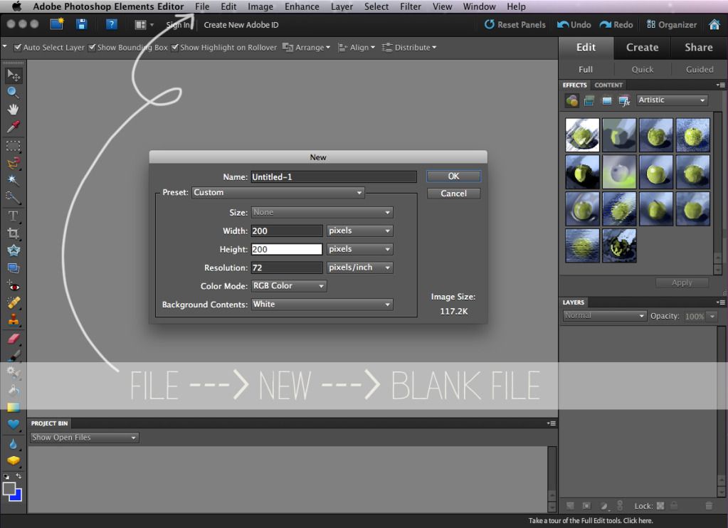
1. Start by opening up Photoshop Elements. Click File --> New --> Blank File to begin. Decide on what size you want your button to be. A good "safe" width for most Blogger blogs is 200 pixels wide, by however tall you want. Since we want a perfect circle, I'll do 200x200. *Make sure your resolution is set to 72 and your Color Mode is RGB! 

Sidenote: Resolution refers to DPI (dots per inch) and 72 is the standard for computer monitors and tvs. Same with RGB. That's because all of the little dots you see making up a tv screen are red, green and blue! 300 is the standard resolution for anything that will be printed. CMYK, which stands for Cyan, Magenta, Yellow and Black , is the color mode for printing.
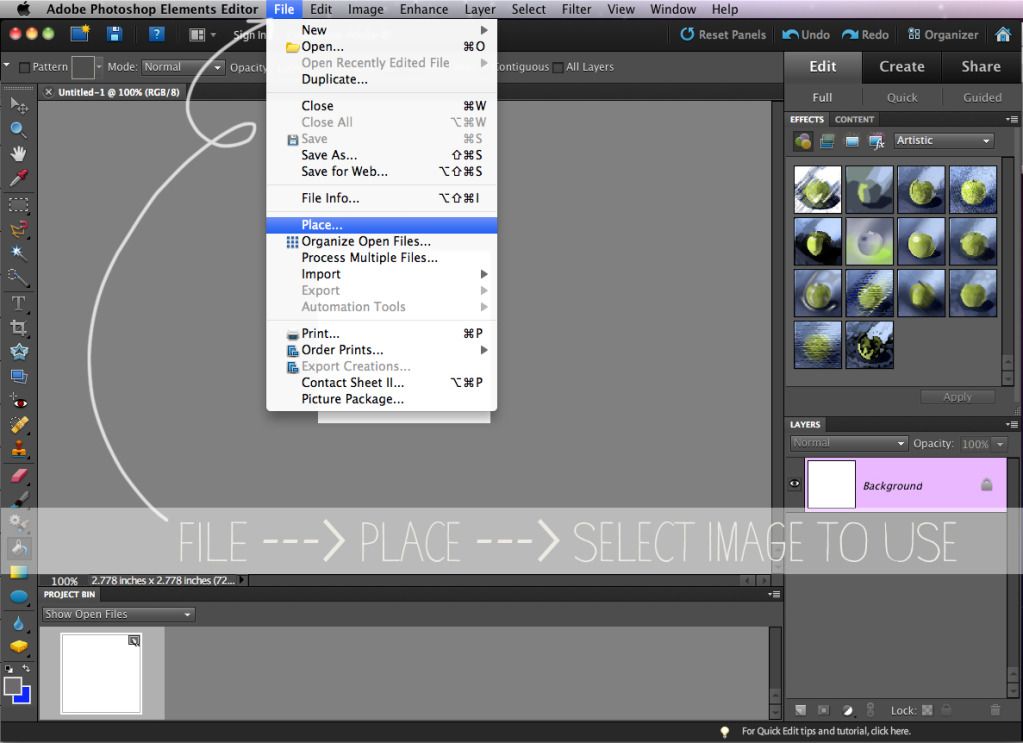

2. Choose the image you want to use as your button by clicking File --> Place. You can Transform your image to fit the canvas by pulling on the anchor points located on the corner of the image and in the middle of each side. *Tip: Hold "Shift" as you transform the image so it will retain it's proportions without getting skewed. 
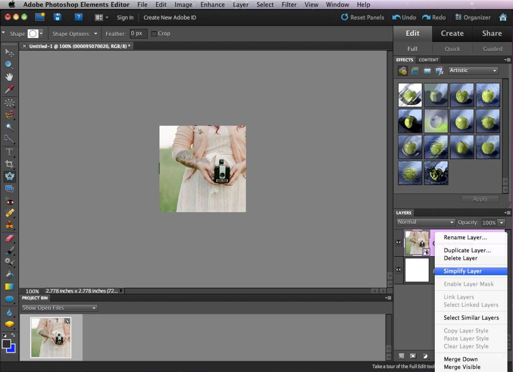

3. Once you have your image situated as you would like, CTRL + Click (Right-click on a PC) the image layer on the Layers palette, and click Simplify Layer. 
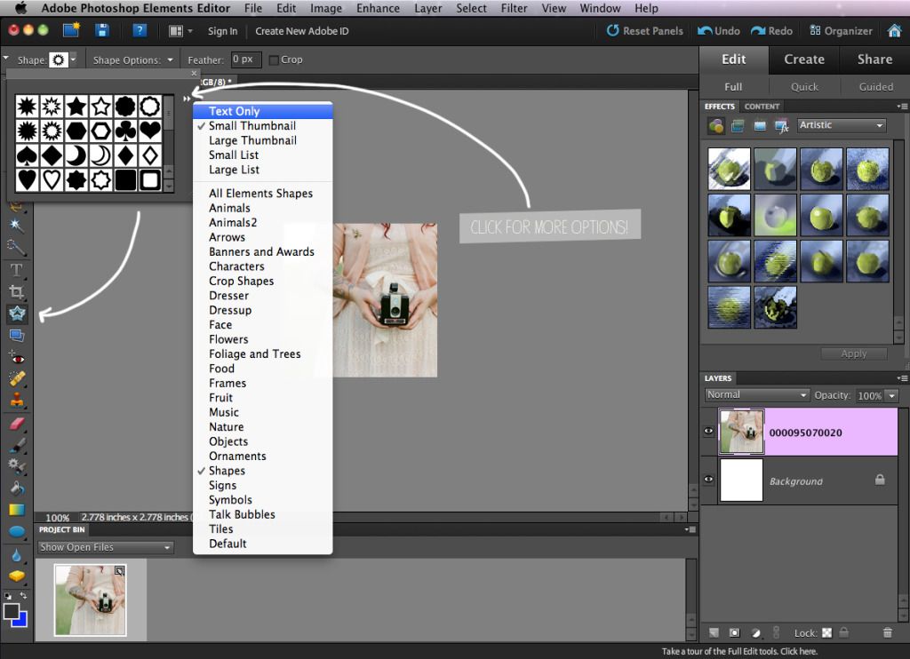

4. After you layer has been simplified, Select the "Cookie Cutter" tool on the left tool bar (It's located under the crop tool, and it looks like stacked stars!). Select the shape you want your button to be made into. For this tutorial, I chose a solid circle. *Tip: Click the two arrows on the right of the shape palette to load even more options!

You can play around with size and placement of your shape as much as you'd like. You can also hold down the Shift key while placing it and it'll keep it's proportions! This is really important when it comes to shapes like circles.
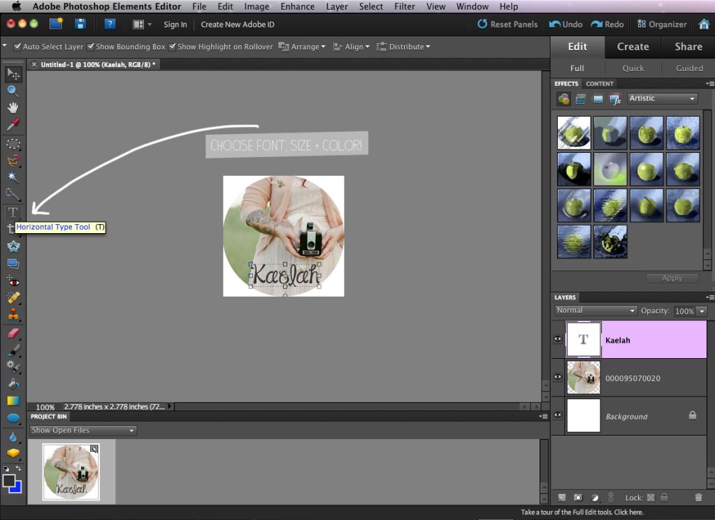

5. If you'd like to add text to your button, Click the Horizontal Type Tool and choose the font, color and size. You can always edit your text after you place it, don't worry! 
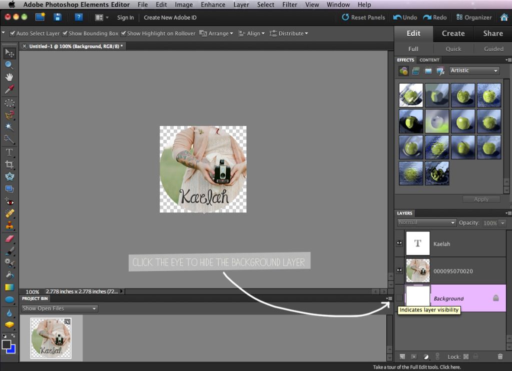

6. If your shape is anything other than a square or rectangle, Click the eye icon to the left of the Background layer to hide it. Once you save your button as a PNG file, this will allow you to put it on any color background and you won't have an ugly white square border behind it. 
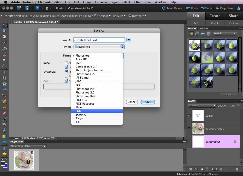

7. Once your button is just how you'd like it, Click File --> Save As and name your button. Choose the folder you'd like it to be saved in and click "Format". Choose PNG if your button is anything other than a square/rectangle, or choose JPEG otherwise. 
*Sidenote: PNG files save the image so that it has a transparent background. A JPEG simply compresses all of the layers and the white background will show up if your shape is a circle, etc. Also, when saving your button as a JPEG, the Options prompt will come up after clicking "Save" and ask you for the Quality. "10" is always a safe bet! If you want to keep a editable version of the button with all of the layers intact, also choose to save a Photoshop/PSD version! You can open this file from Photoshop at any time and make any changes that you want.

Now you're free to use your button for whatever you wish! You can use it as a profile picture on the sidebar, or you can make social media/featured post buttons, too. You can also use this as a way to make your own sharable blog buttons to swap with friends.

If you'd like to have the sharable buttons on your blog, along with the code for people to copy + paste, read below!
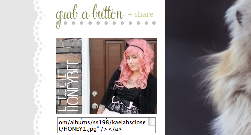

Another question I get pretty often when it comes to blogging is how to code the little box with the HTML for people to take and share. Just copy the HTML in the box underneath, paste it into a widget on your sidebar (or on a Buttons page) and plug in your own URL and image link! *Note: The code below includes the code to have the image above the box as well! That way people know which button they're choosing!

Copy and paste the following code where you want your button + HTML box to show up! Make sure you delete the asterisks (*) before saving!

<*textarea cols="23" rows="2"><*img src="URL TO YOUR BUTTON HERE!"><*a href="URL TO YOUR BLOG/PAGE HERE!"><*img src="URL TO YOUR BUTTON HERE!"><*/a><*/textarea>

Well friends, that'll do it! Hopefully that was decently easy to understand, and hopefully some of you found that helpful! If you have any specific requests for future Photoshop features or tutorials, I'd love to hear them! Just let me know what you'd like to learn!

♥ ♥ ♥ ♥ ♥ ♥ ♥ ♥ ♥ ♥ ♥ ♥ ♥ ♥ ♥ ♥ 

If you'd like to learn more about my role as an Adobe Photoshop Brand Ambassador, just check out this post! You can keep up with the fun tutorials made by all of the other brand ambassadors by checking out Photoshop Elements on Twitter, Facebook, Pinterest and YouTube accounts!

Design Recap

I feel like every single one of my posts just constantly talks about how busy I am or how I can't find time for anything. While I do have busy days, it's hard to talk about them knowing that most all of it goes on behind the scenes and you don't see it. Most of you probably think I just sit in my closet office and twirl my hair all day. (Sometimes I do... but mostly out of designer's block!) Well, here's a little showcase of what I've been up to the past 2 months. I shared a design recap back in February, but I like to showcase these not only to show what I've whipped up, but to also give you some fun new blogs to add to your blog roll! I try to keep myself busy with several clients a week, and I've only caught up this week. But I thought it was prime time to show you some new reads (and share just how many people love the color mint... and scallops!)

And I'll go ahead and apologize for sharing TWELVE designs at one time... I should never do that. I was going to break it up into 2 posts but what the hey?! Here you go! ;) You'll only get the full experience if you click over so go check them out in real-live-view!
Chronicles of a Sweet Tooth
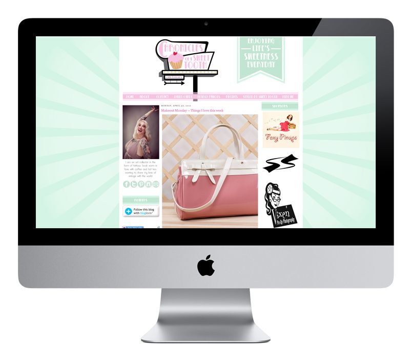
I did Kem's last blog design last year, and this spring she was ready for a revamp. Kem is such a doll. I love her blog because it's the perfect mix of girly, badass, rockabilly and pinup fashion. We did a retro illustrated sign at the top and played up a pink and mint color combo with light flares in the background.
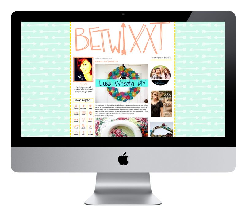
Betwixxt
Grace is a long time sponsor here at LCH and has grown into a totally rad friend. I also did her last blog design last year, and this time around we went for a more hand-drawn look. It was fun to doodle some arrows and her blog name over and over and over. Sounds monotonous, but that's what I totally love doing! We kept most of the same colors overall, but swapped the fuschia for a coral!
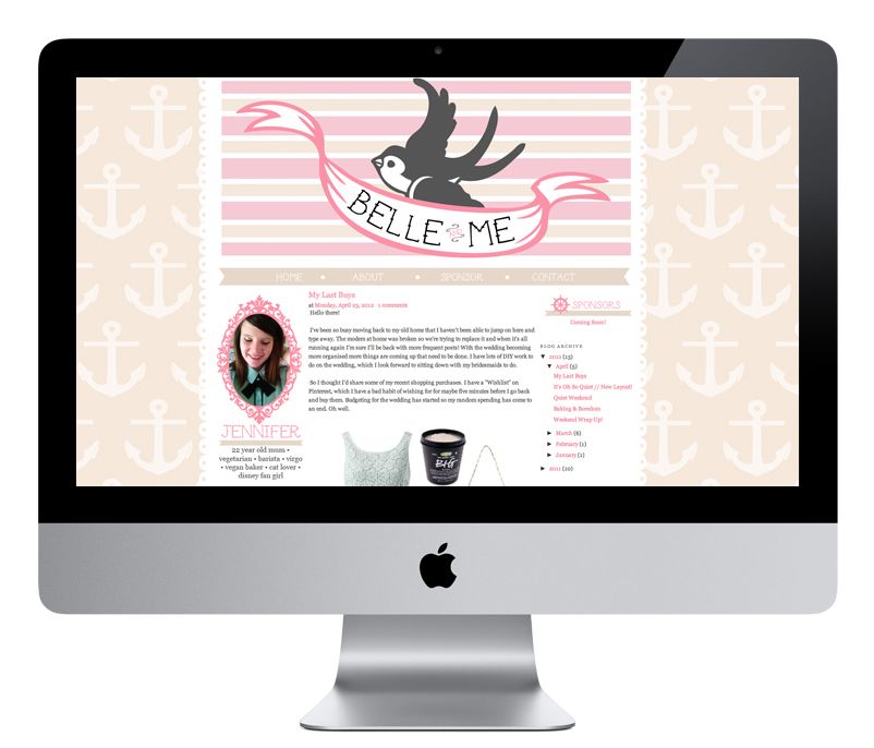
Belle and Me
I loved doing this sweet feminine/Sailor Jerry design. It took us a few tries to get the header perfect but we settled on a simple swallow and banner, with a punch of pattern in the background. You'll find little graphics scattered around like a ship's wheel and a nautical compass. I love the creamy tan with the pink!
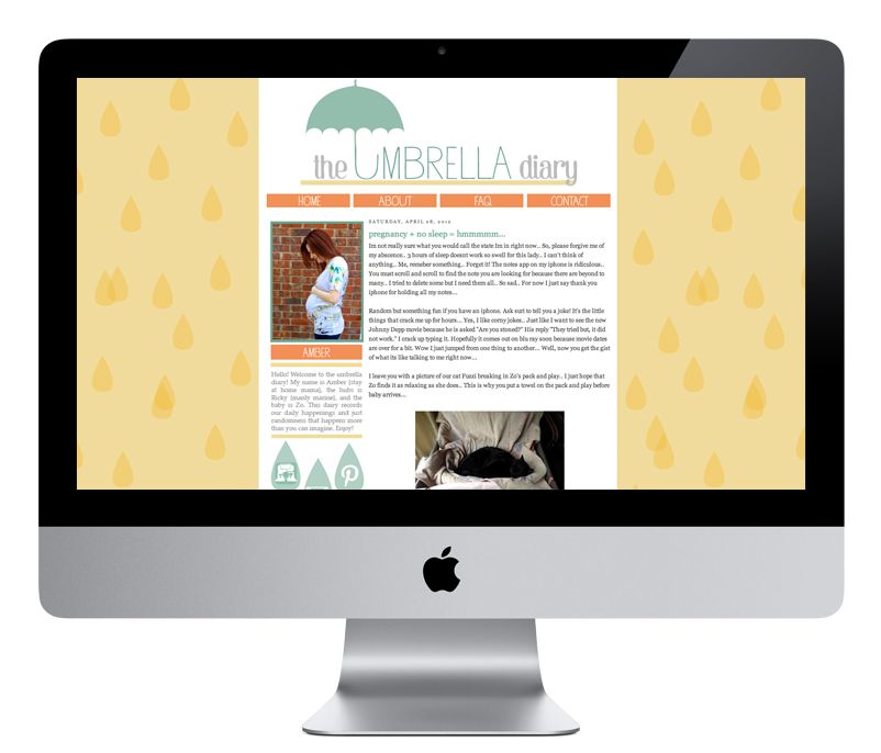
The Umbrella Diary
I love designing a brand new blog for a brand new blogger. When someone dives in head first with a totally custom design, I can't help but watch the story unfold! Amber is preparing for her little bebe and we did an umbrella theme for her blog... because duh, it's called The Umbrella Diary! These were colors I am totally not used to working with, but I love working out of my element.
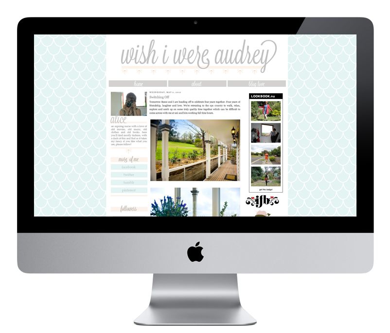
Wish I Were Audrey
Alice's blog just exudes class. How can it not with a name like that?! She pretty much left the entire design up to me and I was so tickled when she loved absolutely everything in the first mock! I feel like that doesn't happen all that often but I've had a slew of incredible clients here lately! They make me love my job. 
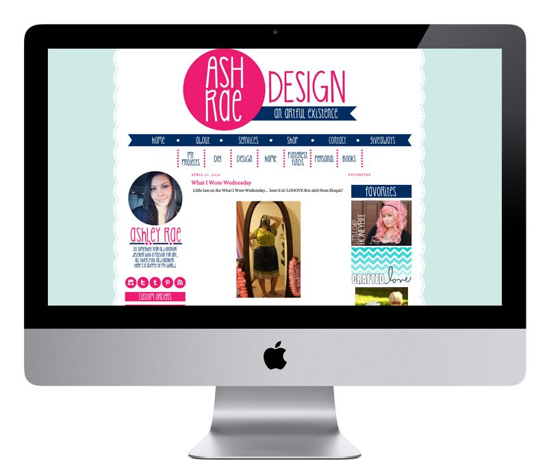
Ash Rae Design
When Ashley first sent me her color swatches, I went white in the face. Not because they were bad or anything, but because I had never worked with a bright lime green before! With fuschia! After a few trial and error color combos, we settled on a mint/baby blue and navy/fuschia. The background you see on here is actually one from a template I designed for my (still to come) shop!
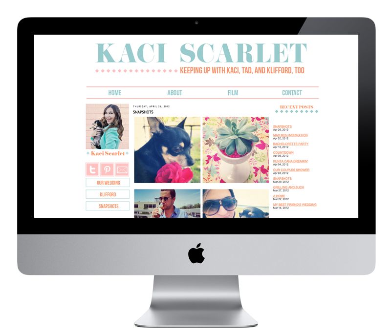
Kaci Scarlet
This is one of my most recent favorites. Everything about it is simple and clean. Again, not something I'm normally used to. The blue, coral and pink color combo has totally won me over and I kind of sorta want to use it on everything!
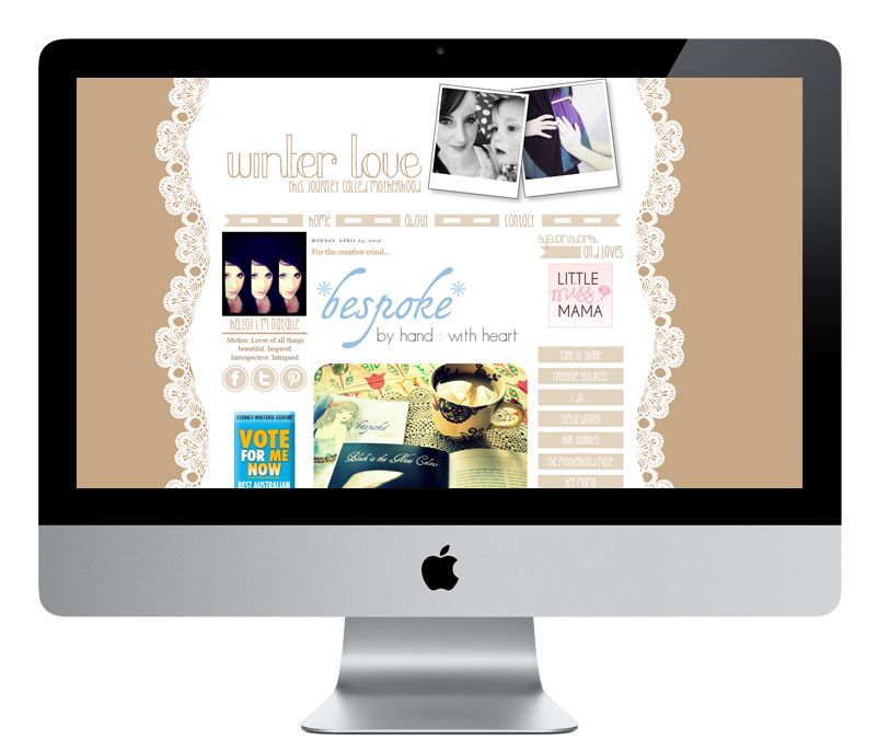
Winter Love
This blog design makes me think of coffee. Undeniable. And perhaps that was because I designed and coded the whole thing while sitting in a coffee shop here on the East Side. It's a little bit different from what I normally do but I loved Natalie's vision and I was so happy to take part in it.
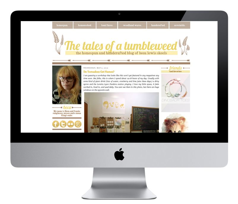
Tales of a Tumbleweed
This is my most recent design... only coded and installed about 2 days ago! Beca is one of my favorite people in the world and I was delighted at the opportunity to give her a new creative space. She's one half of the mastermind behind the Tumbleweeds wooden sunglasses! I'm so glad she ended up loving what I made her!
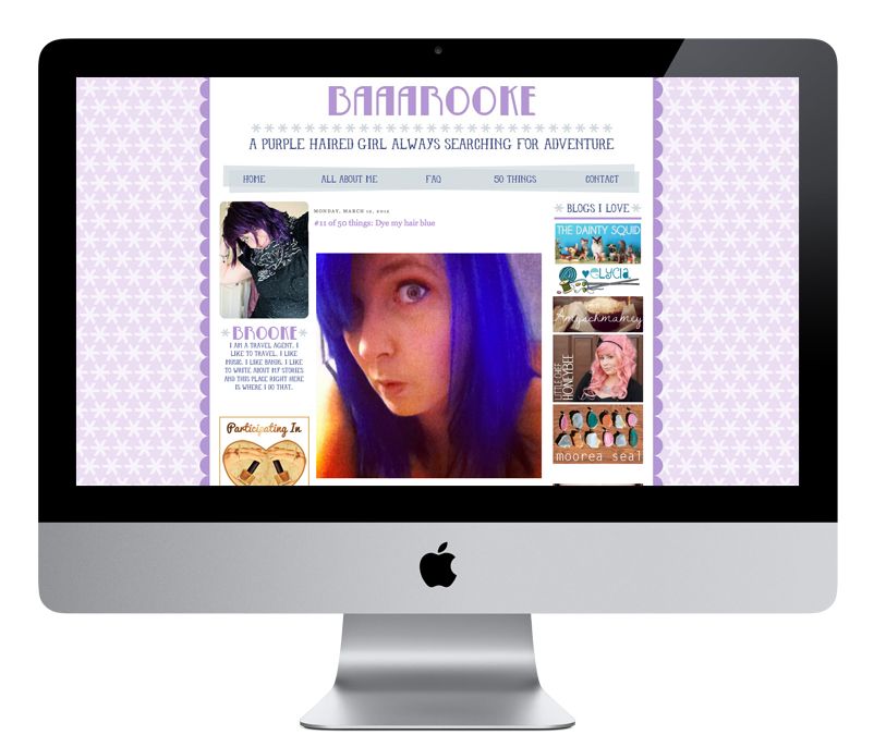
Baaarooke
A purple on purple on purple blog design for a purple haired girl? Um yes! She recently went blue, but I had loads of fun with this one. From little details here and there, to the gradient in the colors, I like this one lots!
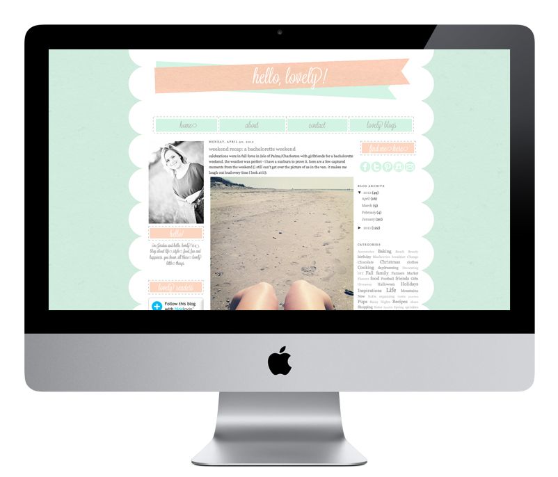
Hello, Lovely!
Another recent one from just this past week. Jordan recently revamped her blog from being just about baking to being more of a lifestyle destination. She wanted scallops and mint... so scallops and mint I gave her! It's simple but classy, and I think that's totally representative of Jordan's aesthetic!

Dermie Pie
This week I also designed a new header for Andrea. She wanted something that was more encompassing of what you'd find on her blog. We decided to go the route of a recipe card, some fun illustrated glasses, flowers and baked treats. Yum!

♥ ♥ ♥ ♥ ♥ ♥ ♥ ♥ ♥ ♥ ♥ ♥ ♥ ♥ ♥ ♥ ♥ ♥ ♥ ♥ ♥ ♥ ♥
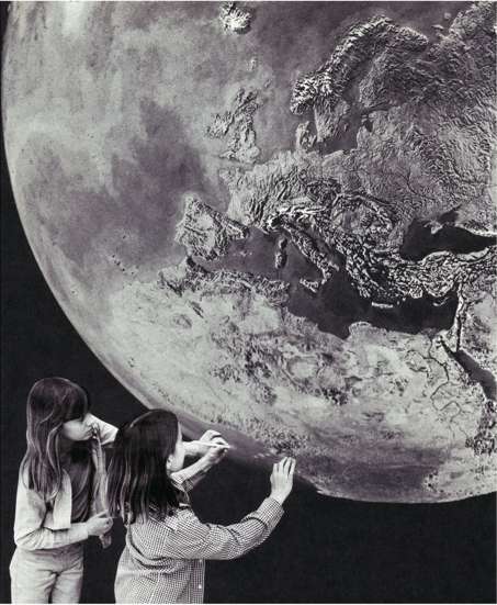
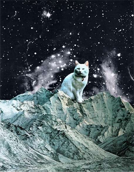
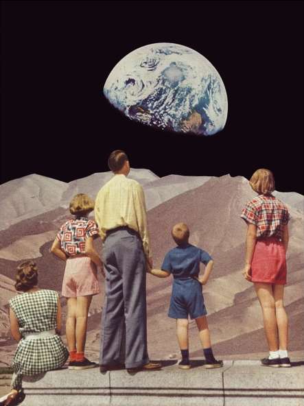
Right now I focus mostly on vector based designs, but I'd really like to work more on texture and raster based work. Illustrator will always be my favorite, there's no denying that, but I'd like to get a little more variation in my portfolio. I'll gladly design whatever it is that the client wants, no doubt, but I do still think I've worked myself in somewhat of a corner with my aesthetic. Is it crazy that I've had this blog design for less than a month and I'm already dreaming up something new? New and totally different! We'll see when I actually get around to doing it!

With that being said, I'm completely caught up on clients, less the 2 I booked this week! I'm eagerly taking on more clients for the rest of the month and beyond, so if you're on the hunt for a Blogger makeover, please don't hesitate to email me! (kaelahbee at gmail dot com) We can chat rates, specifics, inspirations... My turnaround time is incredibly quick when we work together! (If you don't get a response from me this weekend, you'll get it on Monday! Not sure how much internet I'll have. I'm looking forward to stepping away!)

If you want something simple, handdrawn, and/or completely different from what you see above, don't let that stop you from reaching out. I'm eager to try new things and do something different. I ultimately think your blog should be a reflection of you. You should be inspired by it! You are the one who has to write in it... no one else! Make sure you feel good about it.

We're headed out of town for the weekend to celebrate Mike's birthday! He's a Cinco de Mayo boy so everyone likes to drink tequila and eat Mexican food in celebration of him, right? Right! I'll still have goodies lined up for you this weekend. Be sure to check back tomorrow as the giveaway is kind of rad! xo

A Little Chief Honeybee Face Lift

Out with the old...

And in with the new...

If you've been reading my blog for any amount of time at all then you'll probably know that I like to redesign on a whim. I think it's a designer's curse. I had some spare time today (and by that I mean I had about fifteen other things I should've been doing) so I decided to take a tossed mock up from a previous client to give it some life. I first did this roundabout design for a client who later decided on something much more simplified. Not very much changed on LCH actually. Just the top navigation and banner, and then some green in place of the pink. I liked the simplicity of my other layout, but I wanted something fresh and colorful for Spring. I know it's a lot to take it... it's a little bit overwhelming. But that's kind of what I like. When I undoubtedly get tired of this version I'll probably swap back to the simplified one, but until then, here you have it! I realize some of you aren't going to like it, or are going to prefer the old look, but that's okay. This is what it looks like for now ;)

If you're in the market for a redesign, feel free to email me at kaelahbee (at) gmail (dot) com. I'm booked through most of April but I'll gladly jot you down! xo

On The Hunt for Art! Suggestions?

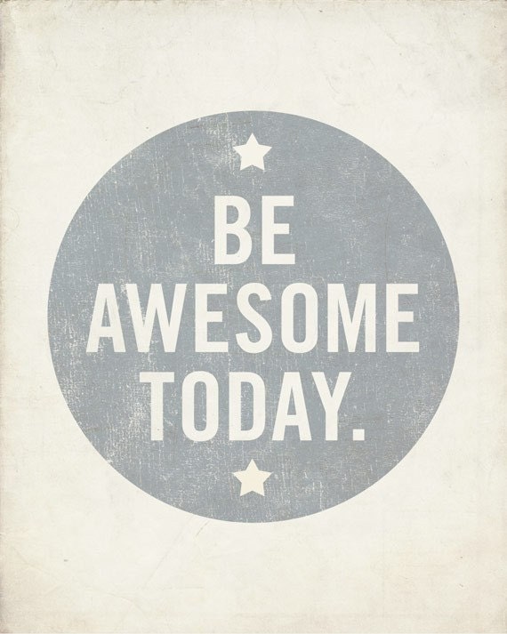
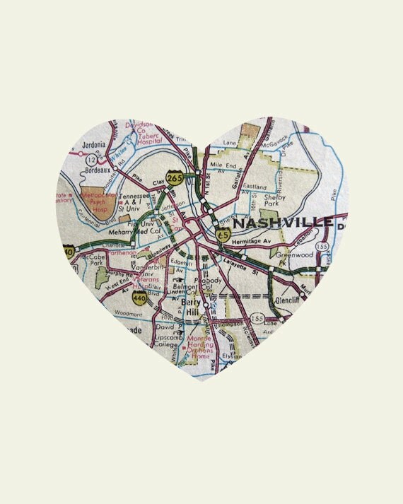
1 // 2 // 3 // 4 // 5

We're really trying to work on finishing up our house, so it doesn't go months and months with bare walls and windows. It always seems like we run at full steam the first few days and then the energy tapers off and we're left with half-way done projects and lots of places to "fill in". We didn't have a lot of wall real estate at the loft (2 full walls of brick does that!) but now we have ample room for prints and posters and we want to brighten the place up with some color! All of our walls have neutral paint (a pretty beige and sage), so we need some pop of excitement. Susannah recently did a cool post about the art hanging in her living room, and we've been on the hunt for some great pieces to add over our mantle, in our bathroom, and all 3 bedrooms. 

I really love the idea of continuing our "Nashville/city" theme prints in the living room. We have 3 full size Anderson Design Group pieces that we have yet to hang. 1 of them commemorates the 2010 flood where we lost our house, and 1 is the 2011 anniversary of the flood. They're really beautiful pieces. We'd like to get our hands on the 3rd piece that goes with that set, but until then we've settled on another Nashville poster. (We love our city!) We also really love sharks and we've got something special planned for our back/third bedroom. 

So I've come to ask the all-knowing, best-design-eye readers around -- Who are some of your favorite illustrators or artists online? I'd love to take a peek and purchase some prints! Are you an artist/illustrator? If so, feel free to link me to your work! I'd really love to find someone to do some fun family portrait type stuff too!

We really want to make our house a home as we'd like to stay here as long as possible (I say that about everywhere!). Really the only thing lacking right now is character on the walls! I promise to share with y'all our picks and progress! We'd like to get varying sizes (4x6, 5x7, 8x10, and poster size (18x24 and even larger!)) to help collage some stuff together. I'd love to see what y'all could suggest!